Weekly Energy Usage Graph – Effective Business Strategy
RB0500015_5
- Last Update 03/13/2025
- File Size 2.2MB
- # of Slides 2
- File Format PPTX
- Slide Ratio 4:3
- Color
Keywords
About the Product
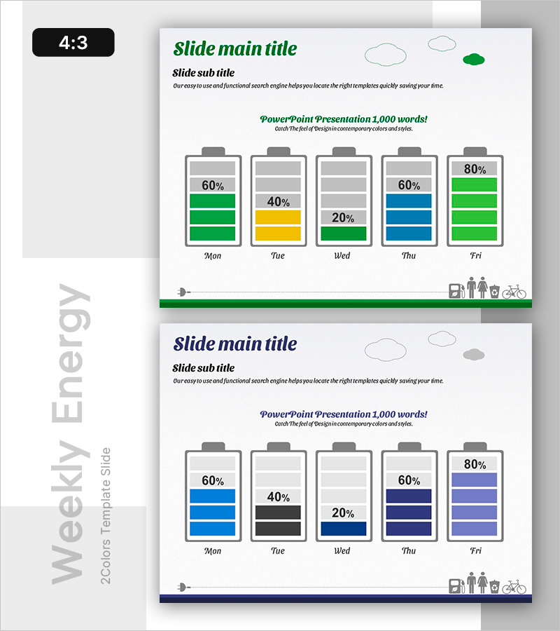
A PowerPoint slide visualizing weekly energy consumption using battery-shaped charts across five weekdays. The slide displays energy usage percentages (ranging from 20% to 80%) with three color combinations: green, yellow, and blue variants. Presented in 4:3 aspect ratio as a 2-slide set, featuring title, subtitle, and descriptive text areas at the top, with icon elements positioned at the bottom. Immediately applicable for business performance reports, energy efficiency analysis, and weekly operational status presentations.
Usage Points
-
Main Usage
Visualizes weekly energy consumption patterns using intuitive battery-shaped charts, enabling quick comparison of daily usage rates. Supports energy efficiency analysis, operational performance tracking, and data-driven decision-making for business strategy development and sustainability initiatives.
-
How to Use
Ideal for weekly performance reports, energy management meetings, operational efficiency presentations, and sustainability reporting. Simply edit the percentage values and color schemes to match your organization's data, then use immediately in presentations without additional design work.
-
Recommended For
Energy managers, operations teams, sustainability officers, business analysts, meeting facilitators, and environmental policy specialists. Particularly valuable for manufacturing, construction, and facility management companies presenting operational status and resource efficiency metrics.
-
Slide Structure
Both slides feature identical layouts with title (green italic), subtitle, and descriptive text at the top; five battery charts (Mon-Fri) in the center showing percentage values; and icon elements (lightbulb, people, briefcase, bicycle) at the bottom. Dual color versions (green-yellow vs. blue-black) allow selection based on organizational branding preferences.
Related Products
-

Real Estate Contract Trend Analysis Chart – Visual Data for Business Success
#Business Introduction #Business Strategy #Diagram
-

Doughnut Chart Slide for Analyzing Technology Data
#Business Introduction #Business Strategy #Graph
-

Spot Multidirectional Diagram – Visualizing Business Strategies
#Product/Service Introduction #Business Strategy #Diagram
-

Donut Chart and Mobile Mockup – Market Share Analysis
#Business Strategy #Market and Competitor Analysis #Graph
