Stylish Bar Chart Slide Design
RJ0400007_7
- Last Update 05/18/2025
- File Size 0.6MB
- # of Slides 2
- File Format PPTX
- Slide Ratio 16:9
- Color
Keywords
- #Content-Based Slides
- #Design-Based Slides
- #Market and Competitor Analysis
- #Diagram
- #Graph
- #Competitor Analysis
- #Market Analysis
- #Table
- #Horizontal Bar
- #Standard Table
- #Horizontal Bar Chart
- #16:9
- #horizontal bar chart PowerPoint
- #bar graph slide template
- #data visualization PPT
- #comparison chart presentation
- #5-item bar chart slide download
About the Product
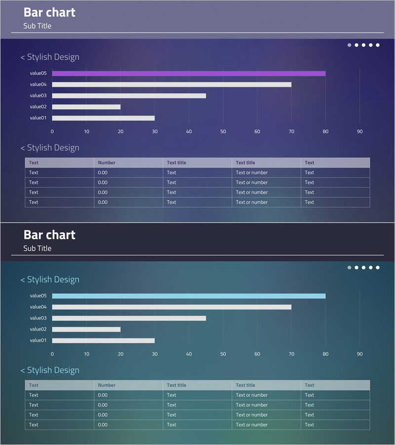
A horizontal bar chart PowerPoint slide optimized for data comparison and ranking visualization. This 2-slide set features a purple and teal dual-tone color scheme with a bar chart displaying 5 items in the upper section and a data table below for detailed information entry. Each bar represents values ranging from 0 to 90, allowing for clear numerical comparison. The slide template is ready to use in business presentations, reports, and analytical documents without additional design work.
Usage Points
-
Main Usage
Visualize and compare numerical data across 5 items using horizontal bars, making rankings and proportional differences immediately clear. Ideal for presenting sales figures, market share, performance metrics, cost comparisons, and other quantitative information with supporting details in the table below.
-
How to Use
Enter item labels and values in the upper bar chart; bar lengths adjust automatically. Fill in the lower table with item names, numbers, and descriptions in the 'Text', 'Number', and 'Text title' columns. Customize the purple and teal colors to match your corporate branding as needed.
-
Recommended For
Finance, sales, and marketing professionals presenting quarterly results, departmental performance, or competitive analysis. Also suitable for academic presentations, consulting reports, and investor pitch decks where quantitative evidence is essential.
-
Slide Structure
2-slide set with each slide containing a horizontal bar chart (5 items, 0–90 scale, purple/white/teal bars) in the upper section and a 5-row × 5-column data table (Text, Number, Text title, Text title, Text columns) below. Dark purple and teal gradient backgrounds unify the design.
Related Products
-

Sugar Content Analysis Bar Graph Table
#Market and Competitor Analysis #Diagram #Graph
-

Blue Green Horizontal Bar Graph – Optimized for Market and Competitive Analysis
#Market and Competitor Analysis #Diagram #Graph
-

Competitor and Customer Analysis Horizontal Bar Graph and Table
#Market and Competitor Analysis #Diagram #Graph
-

Cement Theme Bar Graph & Table
#Market and Competitor Analysis #Diagram #Graph
