Donut Graph by Caries Erosion Status – Essential for Market Analysis
RJ0400034_13
- Last Update 05/26/2025
- File Size 2.2MB
- # of Slides 2
- File Format PPTX
- Slide Ratio 16:9
- Color
Keywords
- #Content-Based Slides
- #Design-Based Slides
- #Business Introduction
- #Market and Competitor Analysis
- #Graph
- #Technological Status
- #Market Share
- #Circles
- #Doughnut Chart
- #16:9
- #donut chart PowerPoint slide
- #pie chart data visualization
- #3-segment ratio graph
- #market analysis PowerPoint template
- #data visualization slides download
About the Product
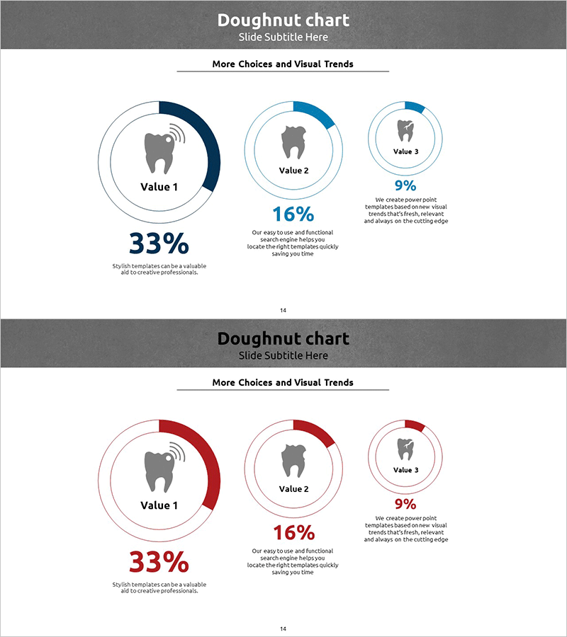
A PowerPoint slide featuring three donut charts that visualize data ratios using blue and red dual-tone color schemes. Each chart displays a central icon and percentage value, making it ideal for market analysis, technology status reports, and market share presentations. The 2-slide set allows you to present multiple datasets side by side for comparative analysis. Formatted in 16:9 widescreen ratio for modern presentation environments. Fully editable PPTX format enables quick customization of data, colors, and labels to match your organization's branding and messaging requirements.
Usage Points
-
Main Usage
Donut charts excel at displaying the proportional relationship between parts and the whole. This slide set visualizes market share, technology stack composition, customer segment distribution, and other ratio-based data across 3-5 categories. The central icon area provides symbolic representation of each data category, enhancing visual comprehension.
-
How to Use
Insert this slide into business presentations, market analysis reports, and technology status briefings to support data-driven arguments. Simply update the percentage values and labels; the chart automatically reflects changes. Customize colors and icons to align with corporate branding. The 2-slide format allows sequential comparison of different datasets or time periods.
-
Recommended For
Marketing managers, technology analysts, business intelligence professionals, and market research specialists use these slides to present ratio-based analysis in executive briefings, investor presentations, and strategic planning sessions. Particularly effective for industry benchmarking, customer segmentation analysis, and technology adoption rate comparisons.
-
Slide Structure
2-slide set with three donut charts per slide arranged hierarchically: large chart on left (33% emphasis), medium chart in center (16% representation), and small chart on right (9% display). Each chart includes a central icon placeholder and percentage text field for data entry, with supporting descriptive text areas for context and insights.
Related Products
-

Pie Chart for Data Comparison – Quality and Color
#Business Introduction #Market and Competitor Analysis #Graph
-

Visualizing Market Share with Donut Chart – Effective Business Analysis
#Business Introduction #Market and Competitor Analysis #Graph
-

Space Theme Market Share Donut Pie Chart
#Business Introduction #Market and Competitor Analysis #Graph
-

Donut Pie Chart for Medical Technology – Market Share Analysis
#Business Introduction #Market and Competitor Analysis #Graph
