Medical System Analysis Detailed Graph – Market Insights
RJ0400033_7
- Last Update 05/26/2025
- File Size 3.3MB
- # of Slides 2
- File Format PPTX
- Slide Ratio 16:9
- Color
Keywords
About the Product
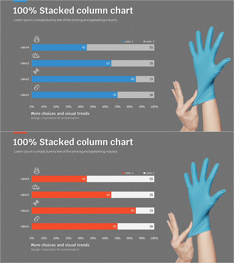
A 100% stacked horizontal bar chart PowerPoint slide designed for medical system analysis and market insights. This presentation template visualizes the proportional composition of four items using two color schemes: blue-gray and orange-gray combinations. Each item is labeled with an icon for intuitive category identification and includes precise numerical values. The gray background provides strong contrast for data clarity, making it ideal for competitive analysis, market share presentations, and healthcare institution comparisons. The 2-slide set offers color variation options to match your presentation tone and branding requirements.
Usage Points
-
Main Usage
Clearly visualize the proportional composition of four items for medical system analysis, market share distribution, and competitive benchmarking. The 100% stacked structure enables immediate comprehension of each item's relative weight against the total, making it highly effective for data-driven decision-making presentations.
-
How to Use
Apply directly to slides requiring ratio data such as healthcare market analysis, patient distribution by department, medical technology adoption rates, and operational metrics comparison. Edit numerical values to input your own data instantly, and leverage icons and labels to clearly communicate each item's meaning to your audience.
-
Recommended For
Healthcare executives, hospital marketing teams, medical consultants, market analysts, and medical technology sales professionals requiring quantitative comparative analysis. Suitable for business plans, market research reports, investor pitch decks, and management performance presentations.
-
Slide Structure
2-slide set featuring identical 4-item stacked bar charts in two color variations: blue-gray and orange-gray palettes. Each slide includes a 0-100% horizontal axis, four item rows with icons, numerical labels, and is optimized for 16:9 widescreen format with gray background for enhanced data visibility.
Related Products
-

Pie Chart & Bar Graph for Market Analysis – Visualizing Data
#Market and Competitor Analysis #Graph #Market Status
-

Business Area Analysis Graph & PC Mockup
#Technical Approach #Market and Competitor Analysis #Graph
-

Minimal Design Visual Data Visualization Slide
#Market and Competitor Analysis #Graph #Market Analysis
-

Simple Cement Theme Analysis Chart – Understanding Competitor and Market Context
#Market and Competitor Analysis #Diagram #Graph
