Market Analysis Vertical Bar Graph – Visualizing Data
RJ0400029_12
- Last Update 05/25/2025
- File Size 0.3MB
- # of Slides 2
- File Format PPTX
- Slide Ratio 16:9
- Color
Keywords
- #Content-Based Slides
- #Design-Based Slides
- #Market and Competitor Analysis
- #Graph
- #Market Analysis
- #Competitive Advantage
- #Column
- #Column Chart
- #16:9
- #vertical bar chart PowerPoint
- #dual-series chart template
- #data comparison slide
- #market analysis chart
- #bar graph presentation
- #numerical data visualization
About the Product
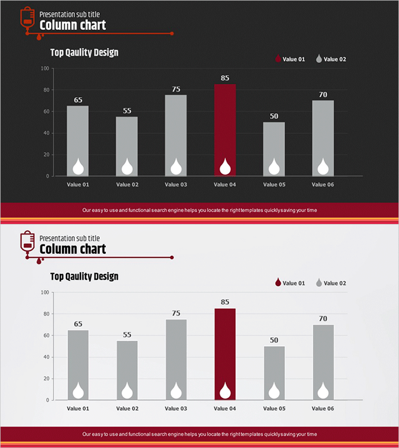
A vertical bar chart PowerPoint slide optimized for market analysis, sales performance, and quarterly comparison presentations. This slide displays 6 items with 2 data series (Value 01 and Value 02) side by side, enabling clear comparative analysis. The dark gray background with light gray and burgundy bar colors provides strong visual contrast, while white icons beneath each item highlight key data points. This presentation template is ready to use in reports, business proposals, and executive briefings.
Usage Points
-
Main Usage
Displays and compares two data series across 6 categories, such as market analysis, sales figures, quarterly performance, or competitive benchmarking. The high-contrast dark background ensures clarity and readability in projector-based presentation environments.
-
How to Use
Simply replace the bar heights and values with your actual data. Modify the legend labels (Value 01 and Value 02) to match your document context, and adjust the number of items as needed for flexible customization.
-
Recommended For
Marketing managers, sales directors, financial analysts, and business executives presenting quarterly results, regional sales comparisons, or product-line revenue analysis will find this template highly effective.
-
Slide Structure
A grouped vertical bar chart with 6 items (Value 01 through Value 06) displaying 2 data series side by side. Features a Y-axis scale from 0 to 100, white accent icons below each item, and a legend in the upper right corner for clear series differentiation.
Related Products
-

Comparative Analysis of Eco-Friendly Categories Slide – Market Competitive Advantage
#Market and Competitor Analysis #Financial Plans and Performance #Diagram
-

Comparative Vertical Graphs by Region – Effective Market Analysis
#Market and Competitor Analysis #Graph #Market Analysis
-

Survey Graph on the Background of the Sea – Market Analysis & Competitive Edge
#Market and Competitor Analysis #Diagram #Graph
-

Column Chart for Comparative Analysis – Market and Competitive Advantage
#Market and Competitor Analysis #Graph #Market Analysis
