Market Status and Trend Graph – Harmony of Blue and Orange
RJ0400021_28
- Last Update 05/23/2025
- File Size 1.4MB
- # of Slides 2
- File Format PPTX
- Slide Ratio 16:9
- Color
Keywords
- #Content-Based Slides
- #Design-Based Slides
- #Market and Competitor Analysis
- #Graph
- #Market Status
- #Industry Trends
- #Horizontal Bar
- #Segmented Horizontal Bar
- #16:9
- #100% stacked bar chart PowerPoint
- #market trend slide template
- #data comparison presentation
- #year-over-year analysis chart
- #business performance graph
About the Product
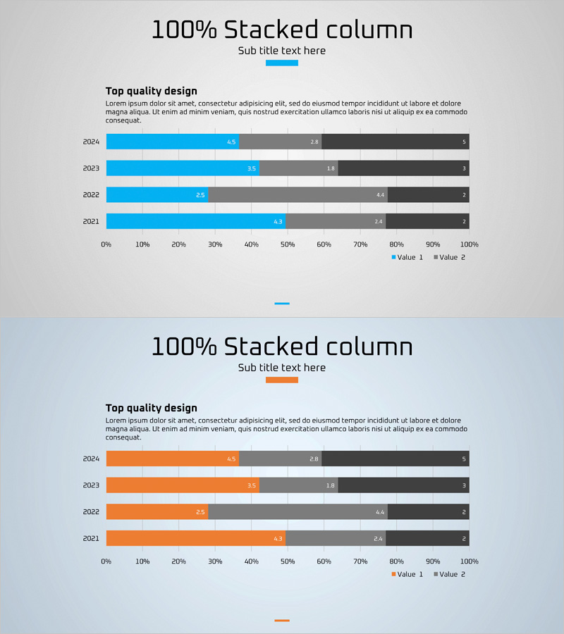
A 100% stacked horizontal bar chart PowerPoint slide that visualizes market status and trends across four years (2021–2024). The slide presents three data series (Value 1, Value 2, and additional metrics) with contrasting blue and orange color schemes, making data differentiation clear against a gray background. Numerical labels are prominently displayed on each bar segment, enabling quick interpretation of proportional changes year over year. This presentation template is ready to use for market analysis reports, competitive benchmarking, business performance reviews, and strategic planning discussions.
Usage Points
-
Main Usage
This chart simultaneously displays year-over-year market changes and proportional data distribution. The 100% stacked structure clearly visualizes the relative contribution of each data series, making it ideal for market analysis, competitive positioning, and business performance trend presentations.
-
How to Use
Double-click the numerical labels on the slide to replace them with your actual data values. The blue, orange, and gray color palette can be customized to match your corporate branding. Year labels and category names are fully editable to adapt the chart for various analytical purposes.
-
Recommended For
Recommended for marketing teams presenting market analysis findings, executive business performance reports, investor pitch decks highlighting market conditions, and strategic planning sessions requiring data-driven discussions. Particularly effective when emphasizing proportional shifts across multiple data categories.
-
Slide Structure
Two-slide layout featuring a blue-accent version and an orange-accent version, each displaying four horizontal bars (2021–2024) stacked to 100%. Each bar segment is labeled with numerical values, and the three data series are color-coded for easy distinction and interpretation.
Related Products
-

Plant Cultivation Awareness Graph – Visualizing Market Status with Horizontal Bar
#Market and Competitor Analysis #Graph #Market Status
-

Technology Service Market Trends and Status – 100% Stacked Bar Chart
#Market and Competitor Analysis #Graph #Market Status
-

Area Graph & Notebook Mockup for Market Trend Analysis
#Market and Competitor Analysis #Graph #Other
-

100% Stack Horizontal Graph – Market Trend Analysis
#Market and Competitor Analysis #Graph #Market Analysis
