Market Analysis and Status Graph - Harmony of Blue and Orange
RJ0400021_20
- Last Update 05/23/2025
- File Size 1.8MB
- # of Slides 2
- File Format PPTX
- Slide Ratio 16:9
- Color
Keywords
- #Content-Based Slides
- #Design-Based Slides
- #Market and Competitor Analysis
- #Graph
- #Market Status
- #Market Analysis
- #Column
- #Segmented Column
- #16:9
- #stacked column chart PowerPoint
- #100% stacked bar graph
- #market analysis slide
- #data visualization template
- #comparison chart PPT
- #year-over-year trend slide
About the Product
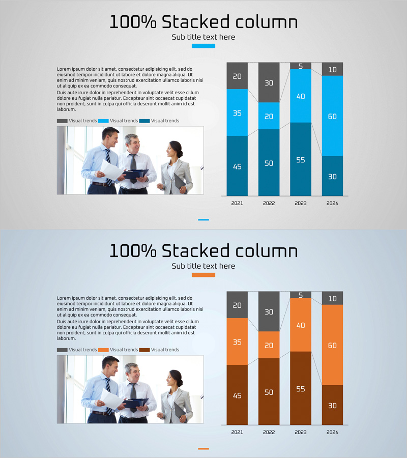
A 100% stacked column chart PowerPoint slide designed to visualize market analysis and status data across four years (2021–2024). The slide features three data series displayed in contrasting blue, orange, and gray color palettes, with numerical labels on each segment for precise data communication. A business meeting image and legend are positioned on the left side to reinforce presentation context. The slide is provided in 16:9 widescreen PPTX format, making it immediately applicable to marketing reports, sales presentations, executive briefings, and strategic analyses. Use this template to compare market share, revenue composition, customer distribution, or any multi-layered comparative data across time periods.
Usage Points
-
Main Usage
Effectively compare compositional ratios across time periods and clearly communicate the relative weight of each component against the total. Ideal for visualizing market share trends, revenue breakdowns, customer segment distribution, product category sales proportions, and multi-dimensional data analysis.
-
How to Use
Open the slide and replace the numerical values in each segment with your own data. Modify the legend and axis labels to match your analysis topic, and customize the left-side image area with your company logo or additional context. The default blue, orange, and gray color scheme can be retained or adjusted to match your brand colors using PowerPoint's built-in tools.
-
Recommended For
Marketing reports, sales presentations, quarterly and annual performance reviews, market research findings, investor presentations, and strategic planning meetings. Recommended for data analysts, marketing professionals, executives, and consultants who need to communicate quantitative comparisons visually and persuasively.
-
Slide Structure
Two-slide set, each featuring one 100% stacked column chart. The first slide uses a blue color gradient (three shades), and the second uses an orange gradient, both displaying 2021–2024 data across four columns with three data series and numerical labels. Layout includes a business meeting photograph and legend on the left, with the chart occupying the right side of each slide.
Related Products
-

Internet Theme Segmentation Bar Graph – Market Status Analysis
#Market and Competitor Analysis #Graph #Market Status
-

Blue Pink Market Analysis Segmented Vertical Bar Graph
#Market and Competitor Analysis #Graph #Market Status
-

Trade Business Analysis Graph – Visualizing Market Status
#Market and Competitor Analysis #Graph #Market Status
-

3D Vertical Segmentation Graph – Market Analysis
#Market and Competitor Analysis #Graph #Market Status
