Future Outlook and Expected Effects Graph – Harmony of Blue and Orange
RJ0400021_15
- Last Update 05/23/2025
- File Size 1.4MB
- # of Slides 2
- File Format PPTX
- Slide Ratio 16:9
- Color
Keywords
- #Content-Based Slides
- #Design-Based Slides
- #Business Strategy
- #Market and Competitor Analysis
- #Graph
- #Financial Outlook & Expected Impact
- #Future Outlook
- #Line
- #Line Chart
- #16:9
- #line chart PowerPoint slide
- #dual-series trend analysis
- #10-year data visualization
- #future outlook graph
- #expected effects chart
- #business performance presentation slide
About the Product
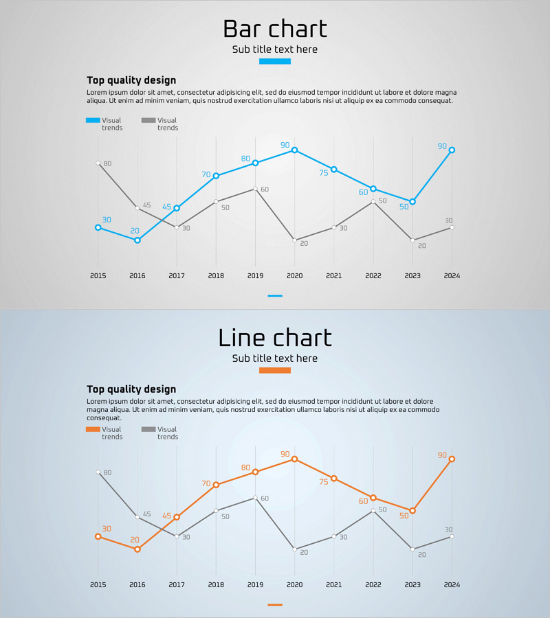
A line chart PowerPoint slide template designed to visualize future outlook and expected effects across a decade of data. This presentation slide features two data series in blue and orange, tracking changes from 2015 to 2024, making it ideal for market analysis, business strategy presentations, and performance comparisons. Each data point is labeled with precise values, and the grid background ensures easy number reading. The slide deck is ready to use in business reports, investor pitches, and strategic presentations, enabling clear communication of performance trends, market dynamics, and forecast data.
Usage Points
-
Main Usage
Clearly visualizes data trends over time for business strategy, market analysis, and performance comparison. The dual-series design allows simultaneous representation of future outlook and expected effects for comparative analysis, supporting executive reporting, investor persuasion, and strategic decision-making with credible data communication.
-
How to Use
Replace the displayed data points and numerical labels with your actual data values. Use the blue series to represent current performance or baseline data, and the orange series for targets or forecast values. Modify the legend and title to fit your specific business context and presentation needs.
-
Recommended For
Recommended for executives, planning teams, marketing departments, sales teams, and finance teams requiring data-driven decision-making. Applicable to business plans, quarterly performance reports, investor pitch decks, marketing strategy documents, and market analysis reports.
-
Slide Structure
Two-slide deck, each containing a dual-series line chart. The horizontal axis spans 2015–2024 (10 years), and the vertical axis ranges from 0 to 90. Each data point features a circular marker with numerical labels. The layout includes a legend (Visual trends and Visual), title section, and descriptive text area for context.
Related Products
-

Technology Service Future Outlook and Expected Effect Graph – A Visual Tool for Business Strategy
#Business Strategy #Market and Competitor Analysis #Graph
-

Line Charts in Urban Background – Business Strategy and Market Analysis
#Business Strategy #Market and Competitor Analysis #Graph
-

Future Outlook and Expected Effects Visualization – Graph Representing Business Strategic Plans
#Business Strategy #Market and Competitor Analysis #Graph
-

Mint Green Curved Line Trend - Revenue Forecast and Expectations
#Business Strategy #Market and Competitor Analysis #Graph
