Future Outlook and Expected Effects Visualization – Graph Representing Business Strategic Plans
RJ0400010_22
- Last Update 05/19/2025
- File Size 0.2MB
- # of Slides 2
- File Format PPTX
- Slide Ratio 16:9
- Color
Keywords
- #Content-Based Slides
- #Design-Based Slides
- #Business Strategy
- #Market and Competitor Analysis
- #Graph
- #Financial Outlook & Expected Impact
- #Future Outlook
- #Line
- #Line Chart
- #16:9
- #line chart PowerPoint slide
- #dual-series trend comparison
- #market analysis chart template
- #business strategy visualization
- #data trend presentation
- #PowerPoint graph template
About the Product
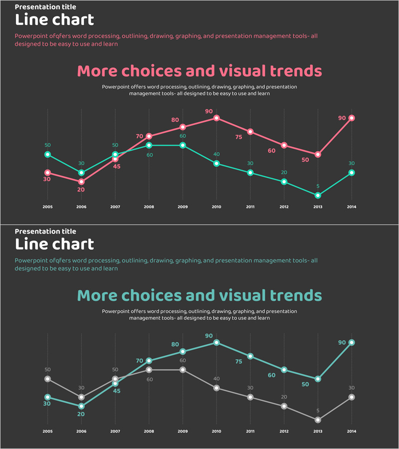
A dual-series line chart PowerPoint slide visualizing 10-year data trends from 2005 to 2014. The pink and teal lines represent comparative metrics for business strategy execution, market analysis, and future outlook projections. Optimized for 16:9 widescreen format with 2-slide layout, ready for immediate use in presentations, reports, and strategic proposals. Each data point displays numerical labels for precise information delivery, while the dark grid background enhances readability and professional appearance.
Usage Points
-
Main Usage
Designed to visualize business performance trajectories, market analysis metrics, and future projections over time. The dual-series format enables direct comparison of competitive benchmarks versus actual results, target versus achievement, or historical versus current trends in a single intuitive view.
-
How to Use
Replace the displayed years (2005–2014) and numerical values with your actual data. Assign the pink line to primary metrics and teal line to comparative data, then insert into the analysis section of reports, business plans, or marketing strategies. The dark background ensures clear visibility during projector presentations.
-
Recommended For
Ideal for executive briefings, business performance reviews, market research presentations, investor pitch decks, and marketing strategy documents. Finance teams, marketing departments, strategy units, and consulting firms benefit from this template when communicating trend analysis and forecasting data.
-
Slide Structure
2-slide layout with identical structure. Each slide displays a dual-series line chart with 10 year-intervals on the X-axis, 0–90 numerical range on the Y-axis, and data point labels at each intersection. Dark gray background with horizontal gridlines ensures data legibility and professional presentation.
Related Products
-

IT Service Future Outlook and Expected Effects Graph – Analyzing Impact
#Business Strategy #Market and Competitor Analysis #Graph
-

Line Charts in Urban Background – Business Strategy and Market Analysis
#Business Strategy #Market and Competitor Analysis #Graph
-

Future Outlook and Expected Effects Graph – Harmony of Blue and Orange
#Business Strategy #Market and Competitor Analysis #Graph
-

Business Strategy Analysis with Line Chart
#Business Strategy #Market and Competitor Analysis #Diagram
