Blue Gray Segmented Bar Graph - Effective Market Analysis
RJ0400018_25
- Last Update 05/22/2025
- File Size 0.3MB
- # of Slides 2
- File Format PPTX
- Slide Ratio 16:9
- Color
Keywords
- #Content-Based Slides
- #Design-Based Slides
- #Market and Competitor Analysis
- #Graph
- #Market Analysis
- #Horizontal Bar
- #Segmented Horizontal Bar
- #16:9
- #segmented bar chart PowerPoint
- #stacked horizontal bar graph
- #market analysis slide template
- #data comparison presentation
- #100% stacked bar chart download
About the Product
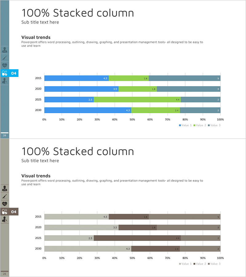
A professional segmented horizontal bar chart PowerPoint slide optimized for market analysis and multi-series data comparison. This template features blue, gray, and green color segments representing 100% stacked bar visualization across four data series. The 2-slide set provides identical chart structures for comparing multiple analysis categories, with clear numerical labels on each segment. Delivered in 16:9 widescreen PPTX format, fully editable and ready to use. Ideal for marketing reports, sales presentations, executive dashboards, and business intelligence visualizations showing market share, revenue composition, customer segmentation, and regional performance metrics.
Usage Points
-
Main Usage
Visualize multi-series data such as market share, revenue breakdown, customer segmentation, and regional sales using 100% stacked horizontal bars. Numerical labels on each segment enable precise ratio comparison at a glance, making it ideal for executive reports, marketing strategy presentations, and sales performance analysis.
-
How to Use
Open the slide, select the chart, and replace existing data with your own figures. The chart automatically updates. Colors, labels, and legend are fully customizable through PowerPoint's chart tools. Extend the data range to add additional series or modify the axis labels as needed.
-
Recommended For
Marketing, sales, finance, strategy, and business intelligence professionals. Recommended for presentations requiring multi-level data comparison, market analysis, business performance reviews, budget allocation analysis, and customer composition breakdowns.
-
Slide Structure
Both slides feature identical 100% stacked horizontal bar chart structures. Four years (2015, 2020, 2025, 2030) are displayed on the Y-axis, with three data series (Value 1, Value 2, Value 3) color-coded. Numerical labels appear on each segment, and the X-axis scale (0%–100%) clearly indicates proportional values.
Related Products
-

Segmented Bar Graph for Market & Competitor Analysis – Simple Theme
#Market and Competitor Analysis #Graph #Competitor Analysis
-

Pie Chart & Bar Graph for Market Analysis – Visualizing Data
#Market and Competitor Analysis #Graph #Market Status
-

Soccer Match Analysis Chart – Performance Analysis and Future Forecast
#Business Vision and Strategy #Market and Competitor Analysis #Graph
-

Target Country Analysis Chart – Data Visualization for Market Analysis
#Market and Competitor Analysis #Graph #Other
