Market Analysis and Trend Graph – Using Blue, Orange, and Green
RJ0400017_32
- Last Update 05/22/2025
- File Size 0.2MB
- # of Slides 2
- File Format PPTX
- Slide Ratio 16:9
- Color
Keywords
- #Content-Based Slides
- #Design-Based Slides
- #Market and Competitor Analysis
- #Graph
- #Market Analysis
- #Industry Trends
- #Horizontal Bar
- #Grouped Horizontal Bar
- #16:9
- #horizontal bar chart PowerPoint
- #grouped bar graph template
- #year-over-year comparison slide
- #multi-series data visualization
- #market analysis chart PowerPoint
About the Product
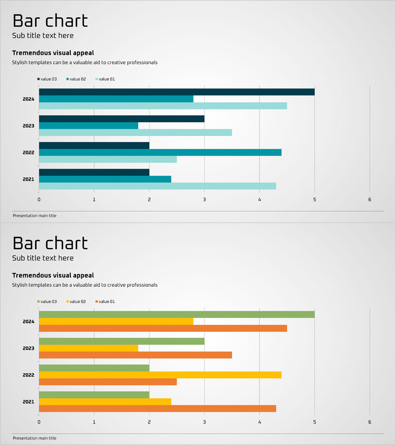
A grouped horizontal bar chart PowerPoint slide comparing 4 data series across years 2021–2024. Dark blue, light blue, orange, and green colors distinguish each series, making it ideal for visualizing market trends, sales performance, and key metrics. Optimized for 16:9 widescreen format with 2 slides ready for immediate editing. Simply input your data values and use in presentations, reports, and business decks.
Usage Points
-
Main Usage
Ideal for comparing multiple data series (by year, department, product, or region) using horizontal bars. Effectively communicates quantitative information such as market analysis, sales figures, performance metrics, and budget allocation in a clear, comparative format.
-
How to Use
Enter numerical values in each year row and the bar lengths adjust automatically. Rename the legend items (value 03, value 02, value 01) to match your categories, adjust colors if needed, and insert into your presentation, report, or dashboard.
-
Recommended For
Recommended for executives, analysts, marketing professionals, sales managers, and finance teams presenting comparative data in board meetings, strategy sessions, quarterly reviews, and performance reports.
-
Slide Structure
2-slide set: first slide uses dark blue, light blue, and orange; second uses dark blue, light blue, and green. Each slide displays 4 years (2021–2024) as horizontal rows with X-axis scale from 0–6 for easy data comparison and readability.
Related Products
-

Blue Orange Bundle Bar Graph - Insights for Market Analysis
#Market and Competitor Analysis #Graph #Competitor Analysis
-

Market Trend Analysis with Horizontal Bar Stacked Chart – Detailed Data Presentation
#Market and Competitor Analysis #Graph #Market Analysis
-

Horizontal Bar Chart for Data Visualization – Stylish Presentation
#Technical Approach #Market and Competitor Analysis #Graph
-

Visual Trend Presentation Slide with Graphs
#Market and Competitor Analysis #Graph #Market Analysis
