Market Analysis Bundle Vertical Bar Graph – Visual Insight Enhancement
RJ0400012_6
- Last Update 05/20/2025
- File Size 1.7MB
- # of Slides 2
- File Format PPTX
- Slide Ratio 16:9
- Color
Keywords
About the Product
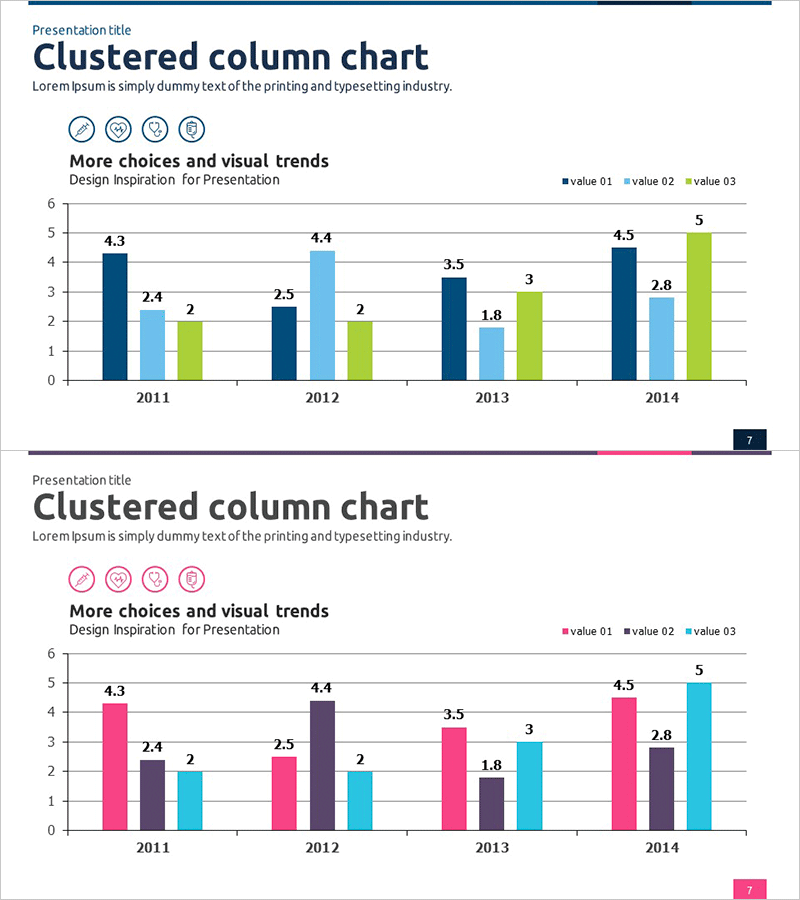
A clustered vertical bar chart PowerPoint slide designed for market analysis and performance comparison across multiple metrics. This presentation template displays data from 2011 to 2014 with three distinct data series positioned side-by-side for each year, enabling quick visual comparison of trends and values. The design uses navy blue, light blue, and lime green color schemes to differentiate each series, with numerical labels displayed above each bar for precise data communication. Ideal for business reports, marketing presentations, sales performance reviews, and strategic planning documents that require multi-series data visualization.
Usage Points
-
Main Usage
Enables simultaneous comparison of multiple data series across time periods, making it ideal for visualizing market trends, sales performance, customer metrics, and competitive analysis. The side-by-side bar arrangement allows stakeholders to quickly identify patterns and make data-driven decisions.
-
How to Use
Simply replace the sample data with your own figures using PowerPoint's built-in chart editing tools. Modify colors, labels, and axis values to match your brand or presentation theme. Add or remove years and data series as needed without affecting the overall layout.
-
Recommended For
Marketing teams presenting market research findings, sales departments reporting quarterly performance, executives reviewing business metrics, consultants preparing proposal decks, and analysts comparing competitive benchmarks. Suitable for any presentation requiring multi-metric comparison.
-
Slide Structure
Two-slide set featuring clustered vertical bar charts with 4 years (2011-2014) and 3 data series per chart. First slide uses blue color palette; second slide uses pink, purple, and cyan palette. Each chart includes data labels and gridlines for easy reading. Formatted in 16:9 widescreen aspect ratio.
Related Products
-

Visual Flow Emphasized Slide Design – Perfect Choice for Data Analysis
#Market and Competitor Analysis #Graph #Market Analysis
-

Marketing Performance Analysis Chart by Year – Visualizing Market Trends
#Market and Competitor Analysis #Diagram #Graph
-

PC Mockup & Column Bundle Graph
#Market and Competitor Analysis #Graph #Other
-

Sales & Performance Status Slide – Data-Driven Insights
#Company Introduction #Market and Competitor Analysis #Diagram
