Market Status and Future Outlook – Data Illustrated in Blue and Yellow
RJ0400008_12
- Last Update 05/18/2025
- File Size 2.1MB
- # of Slides 2
- File Format PPTX
- Slide Ratio 16:9
- Color
Keywords
- #Content-Based Slides
- #Design-Based Slides
- #Market and Competitor Analysis
- #Graph
- #Market Status
- #Future Outlook
- #Column
- #Line
- #Column Chart
- #Line Chart
- #16:9
- #line chart PowerPoint
- #trend analysis slides
- #market data visualization
- #dual-series line graph
- #business presentation template
- #data comparison chart
About the Product
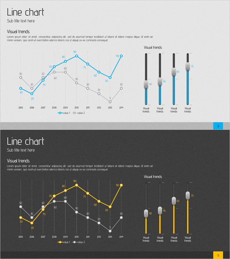
A professional PowerPoint slide comparing market status and future outlook using dual-series line charts in blue and yellow. The left side features a line graph tracking data trends from 2005 to 2014 with gridlines and labeled data points, while the right side complements the visualization with vertical bar charts showing the same metrics. Delivered as a 2-slide set in 16:9 widescreen format, this template is ready for business reports, market analysis presentations, competitive analysis, and executive briefings. All chart elements are fully editable, allowing you to input your own data and customize colors to match your corporate branding.
Usage Points
-
Main Usage
Visualize time-series market data across two comparable metrics using line and bar chart formats to highlight trends and changes over a 10-year period. Enables executives, investors, and stakeholders to quickly grasp performance trajectories and competitive positioning.
-
How to Use
Replace sample data in the left line chart with your actual monthly, quarterly, or annual figures; the trend lines update automatically. Use the right bar charts to emphasize specific data points or period-over-period comparisons. Modify colors and legend labels to align with your brand guidelines.
-
Recommended For
Finance and strategy teams presenting quarterly or annual performance reviews, market research firms analyzing industry trends, consulting firms preparing client proposals, and C-suite executives delivering board reports. Particularly effective for comparing two product lines, regional performance, or competitor benchmarks.
-
Slide Structure
Slide 1: Title area + dual-series line graph (2005–2014 timeline, blue and yellow data series) + gridlines + labeled data points + legend. Slide 2: Title area + four vertical bar charts (each showing blue vs. yellow comparison for specific metrics) + legend. All chart objects are editable and linked to underlying data.
Related Products
-

Successful Proposition Strategy through Market and Competitive Analysis
#Market and Competitor Analysis #Graph #Market Status
-

Consumer Insights & Behavioral Patterns Analysis Slide
#Market and Competitor Analysis #Graph #Market Status
-

Simple Circle Presentation Template Line Chart – Visualizing Market Status
#Market and Competitor Analysis #Graph #Market Status
-

Outlook Analysis Graph for Market and Competitive Analysis
#Market and Competitor Analysis #Graph #Market Status
