Data Visualization with Bar Chart – Stylish Design
RJ0400007_10
- Last Update 05/18/2025
- File Size 1.1MB
- # of Slides 2
- File Format PPTX
- Slide Ratio 16:9
- Color
Keywords
- #Content-Based Slides
- #Design-Based Slides
- #Product/Service Introduction
- #Market and Competitor Analysis
- #Graph
- #Development Status
- #Industry Trends
- #Horizontal Bar
- #Grouped Horizontal Bar
- #16:9
- #grouped bar chart PowerPoint
- #data visualization slides
- #year-over-year comparison chart
- #business presentation template
- #how to create grouped bar chart in PowerPoint
About the Product
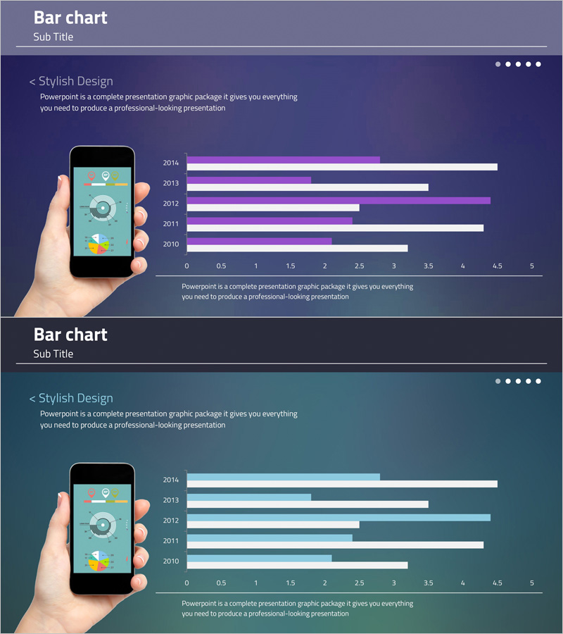
A grouped bar chart PowerPoint slide that clearly displays year-over-year data changes from 2014 to 2010. This presentation slide compares five years of data across two data series using purple and white color contrast to intuitively visualize differences between metrics. Paired with a mobile device mockup, it is ideal for app performance presentations and marketing data analysis reports. The 16:9 widescreen format includes 2 slides ready for immediate editing and customization.
Usage Points
-
Main Usage
Compare multiple numerical values across different time periods, quarters, regions, or categories using two or more data series. Visualize business metrics such as marketing performance, sales results, user growth, and market share in a single, easy-to-understand format.
-
How to Use
Insert into executive reports, quarterly performance presentations, marketing analytics reports, and investor pitch decks where numerical comparisons are essential. Use the mobile mockup to emphasize app download trends or mobile user growth trajectories in technology and digital product presentations.
-
Recommended For
Finance and planning teams presenting quarterly results, marketing teams analyzing campaign performance, sales teams comparing regional revenue, and executives in strategic planning meetings. Suitable for any business presentation requiring data-driven decision-making and comparative analysis.
-
Slide Structure
Each slide features a title area, descriptive text, grouped bar chart with 5 years of data across 2 series (10 bars total), horizontal axis ranging from 0 to 5, and year labels. Mobile device mockup positioned on the left provides visual consistency for mobile app data presentations.
Related Products
-

Market Trend Change Analysis Graph – Key Insights Visualization
#Product/Service Introduction #Market and Competitor Analysis #Graph
-

Bundled Horizontal Bar Graph for Market Trend Analysis – A New Perspective on Data
#Market and Competitor Analysis #Graph #Market Status
-

Competitor Analysis and Market Trends Graph – Contrast of Blue and Red
#Market and Competitor Analysis #Graph #Competitor Analysis
-

Blue Green Bundled Chart – Visualizing Market Trends
#Market and Competitor Analysis #Graph #Industry Trends
