Bundled Horizontal Bar Graph for Market Trend Analysis – A New Perspective on Data
RJ0200003_15
- Last Update 03/29/2025
- File Size 0.3MB
- # of Slides 2
- File Format PPTX
- Slide Ratio 16:9
- Color
Keywords
- #Content-Based Slides
- #Design-Based Slides
- #Market and Competitor Analysis
- #Graph
- #Market Status
- #Industry Trends
- #Horizontal Bar
- #Grouped Horizontal Bar
- #16:9
- #grouped horizontal bar chart PowerPoint
- #multi-series bar graph template
- #year-over-year comparison slide
- #market trend analysis chart
- #data comparison presentation template
About the Product
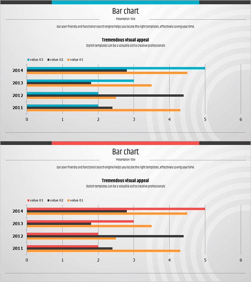
A grouped horizontal bar chart PowerPoint slide comparing data across 4 years (2011–2014) with 3 distinct data series. This presentation template is designed for market trend analysis, competitive benchmarking, sales performance tracking, and multi-dataset comparisons. The chart uses cyan, orange, and black colors to clearly differentiate each data series, with a horizontal axis ranging from 0 to 6 and year-based row organization for intuitive data visualization. Ideal for executive reports, quarterly reviews, market research presentations, and any business scenario requiring side-by-side numerical comparison in your slides.
Usage Points
-
Main Usage
Visualizes numerical comparison of 3 data series across 4 years (2011–2014). Commonly used for market trend analysis, competitive performance benchmarking, departmental or product sales tracking, quarterly growth rate comparison, and multi-metric business performance reviews.
-
How to Use
Enter data values into the 3 bars (cyan, orange, black) for each year row; bar lengths adjust automatically. Customize legend labels and axis titles to match your presentation context. Color modification is straightforward. The 2-slide set allows you to present the same data with alternative color schemes.
-
Recommended For
Executive performance reports, quarterly and annual results presentations, market research findings, competitive analysis briefings, marketing performance reviews, investor pitch decks, consulting proposals, and any data-driven comparative analysis across finance, sales, marketing, operations, and strategy teams.
-
Slide Structure
2-slide template. Each slide contains a grouped horizontal bar chart with 4 years (2011–2014) on the vertical axis and 3 data series (value 03, value 02, value 01) per year. Includes horizontal axis (0–6 range), year labels, 3-color legend, and title/subtitle areas.
Related Products
-

Data Visualization with Bar Chart – Stylish Design
#Product/Service Introduction #Market and Competitor Analysis #Graph
-

Blue Green Yearly Bundle Horizontal Bar Chart
#Market and Competitor Analysis #Graph #Industry Trends
-

Technology Service Market Trends and Status – 100% Stacked Bar Chart
#Market and Competitor Analysis #Graph #Market Status
-

Market Overview PowerPoint Slide – Two Panel Market Analysis
#Market and Competitor Analysis #Graph #Market Status
