History Connection Diagram – Visualizing Historical Flow
RJ0300081_4
- Last Update 05/12/2025
- File Size 1.5MB
- # of Slides 2
- File Format PPTX
- Slide Ratio 16:9
- Color
Keywords
About the Product
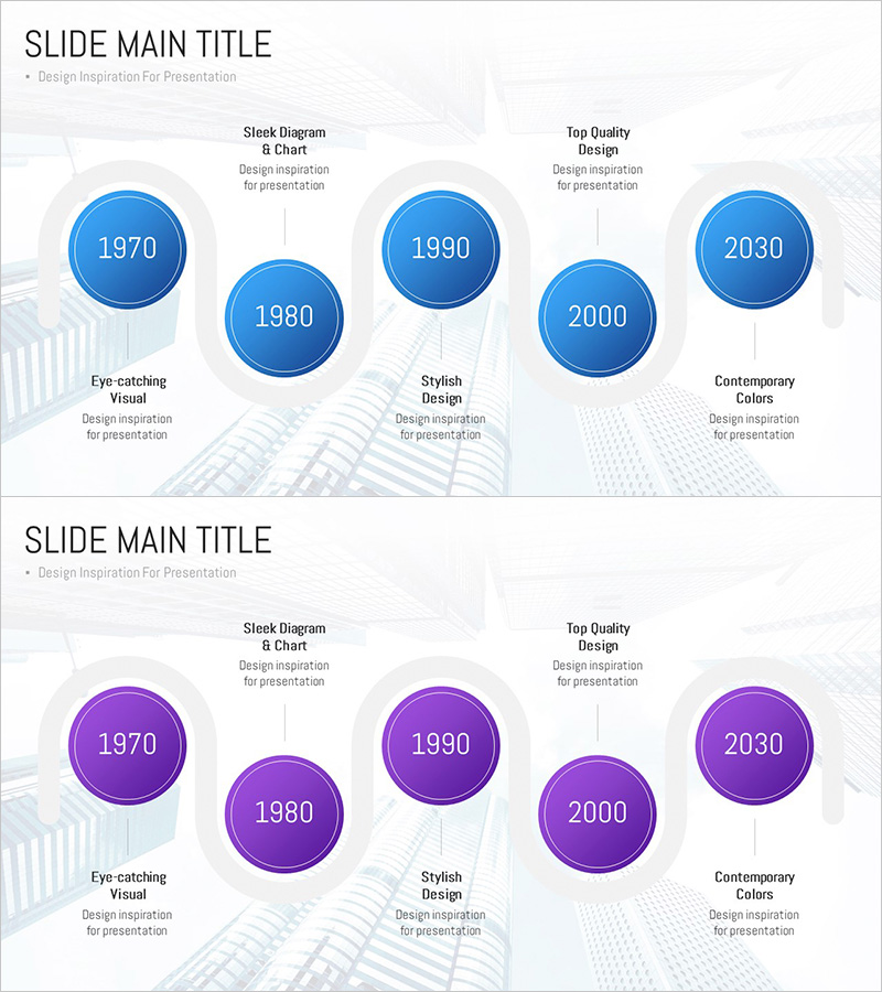
A timeline diagram PowerPoint slide featuring five circular nodes connected in linear sequence, visualizing historical flow from 1970 to 2030. Each node is rendered with blue gradient styling and connected by a central vertical line that clearly establishes chronological order. The 2-slide set includes blue and purple color variations, allowing you to match your presentation tone. This PowerPoint slide design is optimized for communicating time-based information such as company history, project milestones, and technology development phases.
Usage Points
-
Main Usage
Presents historical progression, company milestones, project timelines, and technology development stages in a linear format. Input years, events, and achievements into each node to convey time-based information intuitively to your audience.
-
How to Use
Apply to company profile presentations (history section), business plans (implementation timeline), technical proposals (development roadmap), and marketing plans (campaign schedule). Enter years or key events in the circular nodes and add detailed descriptions in the text areas below each node.
-
Recommended For
Executive presentations to investors, project manager status reports, marketing team campaign schedule explanations, technical team development roadmap presentations, and educational institution history or progress demonstrations.
-
Slide Structure
2-slide set. Each slide contains 5 circular nodes (approximately 80px diameter) connected by a central vertical line. Nodes display years (1970, 1980, 1990, 2000, 2030) and are arranged alternately left and right with title and description text areas below each node. Slide 1 uses blue color scheme; Slide 2 applies purple color scheme.
Related Products
-

History Flag Shape Diagram - Company Growth and Vision
#Company Introduction #Diagram #History
-

Fountain Pen History Diagram – Emphasizing Corporate Identity
#Company Introduction #Product/Service Introduction #Diagram
-

Business Connection Diagram – Cluster and History
#Company Introduction #Diagram #Company Overview
-

Spade Shape Theme History Diagram – Emphasizing Company Development
#Company Introduction #Diagram #History
