Efficient Diagram Slide for Business Performance Analysis
RJ0300080_27
- Last Update 05/11/2025
- File Size 1.3MB
- # of Slides 2
- File Format PPTX
- Slide Ratio 16:9
- Color
Keywords
- #Content-Based Slides
- #Design-Based Slides
- #Market and Competitor Analysis
- #Graph
- #Competitor Analysis
- #Market Analysis
- #Horizontal Bar
- #Segmented Horizontal Bar
- #16:9
- #horizontal bar chart PowerPoint
- #business performance analysis slide
- #data comparison chart template
- #multi-series bar graph presentation
- #how to create bar chart in PowerPoint
About the Product
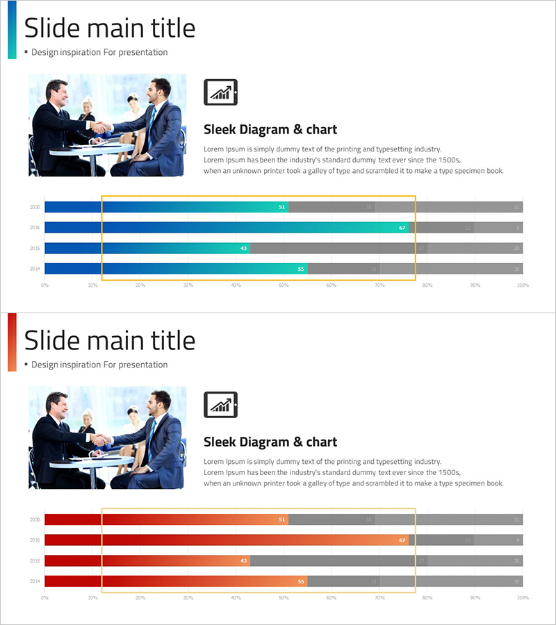
A horizontal bar chart PowerPoint slide designed for business performance analysis and data comparison. This 2-slide template uses contrasting blue and red color schemes to visualize performance metrics across four years (2021–2024) with three data series per slide. Each bar is segmented into multiple categories (blue, cyan, gray or red, orange, gray) with yellow highlight boxes emphasizing key figures. The slide deck is ready to download and edit for presentations, reports, and performance reviews covering sales, marketing effectiveness, operational metrics, and strategic KPIs.
Usage Points
-
Main Usage
Visualize year-over-year or department-by-department performance metrics using horizontal bar charts. The contrasting blue and red color palettes make data differences immediately apparent, while yellow highlight boxes draw attention to critical figures. Ideal for executive briefings, quarterly performance reviews, and marketing impact assessments.
-
How to Use
Edit the bar lengths and numerical values to match your dataset. Slide 1 features a blue color scheme; Slide 2 uses red—select based on your presentation flow. Customize legends and axis labels to represent sales revenue, customer satisfaction scores, market share, or any comparative metric. All elements are fully editable in PowerPoint.
-
Recommended For
Executives, marketing managers, sales directors, financial analysts, and consultants presenting quarterly or annual performance results. Particularly effective when comparing multiple data series or contrasting two scenarios (forecast vs. actual, year-over-year, or competing strategies).
-
Slide Structure
2-slide template. Each slide contains a horizontal bar chart with 4 years (2021–2024) on the Y-axis and 0–100% scale on the X-axis. Each year displays 3 data series as stacked horizontal bars (blue/cyan/gray or red/orange/gray), with a yellow-bordered box highlighting a specific range or key metric.
Related Products
-

Chemical Experiment Analysis Horizontal Bar Graph
#Market and Competitor Analysis #Graph #Competitor Analysis
-

VR Market Analysis Bar Graph – Understanding Competitive Landscape
#Market and Competitor Analysis #Graph #Competitor Analysis
-

Business Service Analysis Segmentation Graph – Ideal for Market and Competitor Analysis
#Market and Competitor Analysis #Graph #Competitor Analysis
-

Market Analysis Graph Ahead of the Future – Innovative Business Insights
#Market and Competitor Analysis #Diagram #Graph
