Visual Trend Presentation Slide with Graphs
RJ0300080_23
- Last Update 05/11/2025
- File Size 1.6MB
- # of Slides 2
- File Format PPTX
- Slide Ratio 16:9
- Color
Keywords
- #Content-Based Slides
- #Design-Based Slides
- #Market and Competitor Analysis
- #Graph
- #Market Analysis
- #Target Market
- #Horizontal Bar
- #Grouped Horizontal Bar
- #16:9
- #horizontal bar chart PowerPoint
- #world map slide template
- #data visualization presentation
- #regional comparison chart
- #multi-data slide design
About the Product
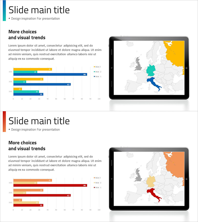
A 2-slide PowerPoint presentation designed for visual trend analysis and regional data comparison. The first slide features a horizontal bar chart with 5 data categories paired with a color-coded world map highlighting key regions. The second slide uses the same layout with orange and red color schemes to represent different datasets. Each slide combines quantitative bar graph data on the left with geographic color-differentiated mapping on the right, enabling simultaneous presentation of numerical performance and spatial information. Ideal for presentations, business reports, and marketing materials showcasing regional performance, market share, sales trends, and global expansion strategies.
Usage Points
-
Main Usage
Designed to simultaneously display regional and geographic data alongside quantitative metrics. The horizontal bar chart clarifies numerical comparisons while the color-coded world map intuitively conveys regional performance, market penetration, sales volume, and geographic distribution.
-
How to Use
Apply to marketing reports, executive presentations, and market analysis briefings when presenting regional performance metrics. Edit bar chart values and adjust map colors to match your data for immediate deployment. Particularly effective for international business strategy presentations and global market expansion discussions.
-
Recommended For
Recommended for executives, marketing managers, sales directors, management consultants, and data analysts presenting regional performance reports. Suitable for quarterly and annual results presentations, global market entry strategies, regional sales analysis, and geographic expansion planning.
-
Slide Structure
2-slide layout with consistent design. Each slide features a horizontal bar chart (5 categories, 4 data series, legend included) on the left and a color-coded world map (3-4 highlighted regions) on the right. Slide 1 uses blue, orange, and green color palette; Slide 2 features orange and red variations.
Related Products
-

European Target Market Analysis Bar Graph – Market Vision and Opportunities
#Market and Competitor Analysis #Graph #Other
-

Target Country Analysis Bar Graph Map – Providing Market Insights
#Market and Competitor Analysis #Graph #Other
-

Year-over-year Comparison Analysis Bar Graph – Market Trends and Insights
#Market and Competitor Analysis #Graph #Market Analysis
-

In-depth Analysis Diagrams & Charts – Insightful Technical Analysis
#Technical Approach #Market and Competitor Analysis #Diagram
