Data Visualization through Vertical Bar Graph – Effective Presentation
RJ0300079_15
- Last Update 11/06/2025
- File Size 0.4MB
- # of Slides 2
- File Format PPTX
- Slide Ratio 16:9
- Color
Keywords
About the Product
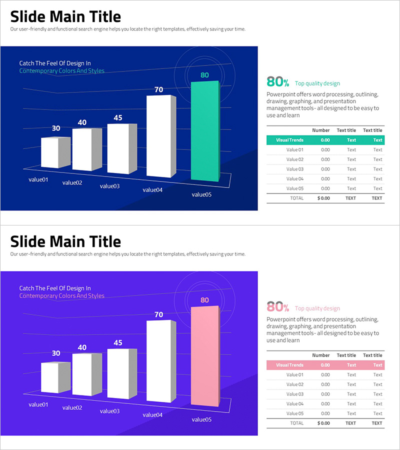
A vertical bar chart PowerPoint slide comparing five data values with navy blue background and white-mint two-tone bars. Each bar is labeled with numerical values at the top for clear data visualization. The right side features an integrated data table with detailed metrics and percentage information, enhancing audience comprehension. This slide design works seamlessly in business presentations, quarterly reports, market analysis documents, and performance dashboards. The layout combines visual impact with data accuracy for professional business communication.
Usage Points
-
Main Usage
This vertical bar chart is optimized for comparing five data points and displaying ranking differences. The bar heights convey numerical variations intuitively while labels and table data provide precise information simultaneously. Ideal for sales figures, market share, performance metrics, and quantitative analysis.
-
How to Use
Use in business report performance sections, marketing plan market research results, investor pitch deck performance indicators, and proposal competitive analysis. Customize bar colors and values to match your specific data. The integrated table allows for both visual and numerical data presentation on a single slide.
-
Recommended For
Finance and accounting professionals, marketing strategists, sales managers, executive report presenters, management consultants, and data analysts presenting quantitative performance and comparative analysis. Particularly suited for quarterly and annual performance reviews and competitive benchmarking.
-
Slide Structure
Left side features five vertical bars (value01 to value05, ranging 30–80) with white and mint coloring. Right side contains a data table with Visual Trends header, five data rows, and TOTAL row. Navy blue background emphasizes the mint-colored bar representing the highest value. Two-slide set includes navy and purple background variations.
Related Products
-

Future Outlook Analysis Bar Graph – Essential for Market Analysis
#Market and Competitor Analysis #Graph #Future Outlook
-

Business Meeting Analysis Bar Graph Slide – Market and Competitive Analysis
#Market and Competitor Analysis #Graph #Future Outlook
-

Market Analysis Comparison Graph – Insights into Future Trends
#Market and Competitor Analysis #Graph #Future Outlook
-

Profit Forecast Graph
#Market and Competitor Analysis #Graph #Future Outlook
