Infographic Slide for Regional Data Visualization
RJ0300079_10
- Last Update 09/11/2025
- File Size 3.8MB
- # of Slides 2
- File Format PPTX
- Slide Ratio 16:9
- Color
Keywords
- #Content-Based Slides
- #Design-Based Slides
- #Market and Competitor Analysis
- #Marketing Plan and Strategy
- #Graph
- #Other
- #Target Market
- #Target Market Strategy
- #Circles
- #Doughnut Chart
- #Map
- #16:9
- #world map PowerPoint slide
- #regional data visualization presentation
- #circular diagram template
- #global analysis slide
- #geographic comparison infographic
- #international business chart
About the Product
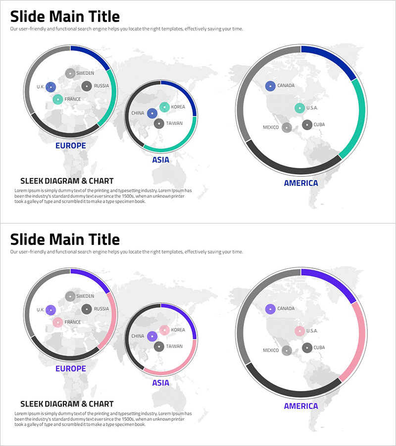
A professional PowerPoint slide for visualizing global business data by region. This template features a world map background with three circular diagrams representing Europe, Asia, and America, each displaying key countries and regional data. The design uses blue, teal, and gray color segments to show regional proportions and comparative metrics in an intuitive format. Country labels and data points are positioned around the circular charts for clear information hierarchy. The 16:9 widescreen template includes 2 slides in fully editable PPTX format, ready for immediate customization with your own regional analytics and performance metrics.
Usage Points
-
Main Usage
Designed to present quantitative regional data at a glance, combining geographic context with proportional visualization. Perfect for global market analysis, regional sales performance, international expansion metrics, and cross-regional business comparisons that require both spatial and numerical clarity.
-
How to Use
Input your regional data into each circular diagram and edit country labels and numerical values. Adjust the size of color segments to reflect actual proportions, and add text labels for specific metrics. Keep the background map fixed while modifying only the chart elements to maintain consistent design throughout your presentation.
-
Recommended For
International marketing teams, global sales executives, business analysts, market research professionals, and multinational corporation strategists. Ideal for regional performance reports, global expansion planning, international market assessments, and cross-border business strategy presentations.
-
Slide Structure
2-slide template featuring a world map background with 3 regional circular diagrams (Europe, Asia, America). Slide 1 uses blue, teal, and gray color scheme; Slide 2 offers blue, pink, and gray variation. Each circular chart contains 4-6 country nodes with proportional segments for flexible data representation.
Related Products
-

Analysis of European Target Regions – Insights for Marketing Strategy Development
#Market and Competitor Analysis #Marketing Plan and Strategy #Graph
-

Area Graph for Competitor Analysis
#Market and Competitor Analysis #Marketing Plan and Strategy #Graph
-

Graph of the Status of European Target Region Analysis – Market Trends Visualization
#Market and Competitor Analysis #Marketing Plan and Strategy #Graph
-

Slide Visualizing America with Contemporary Colors
#Market and Competitor Analysis #Marketing Plan and Strategy #Graph
