Customer Ratio Analysis Slide – Delivering Market Competitiveness
RJ0300078_21
- Last Update 05/10/2025
- File Size 0.7MB
- # of Slides 2
- File Format PPTX
- Slide Ratio 16:9
- Color
Keywords
- #Content-Based Slides
- #Design-Based Slides
- #Market and Competitor Analysis
- #Graph
- #Customer Analysis
- #Competitive Advantage
- #Circles
- #Doughnut Chart
- #16:9
- #donut chart PowerPoint slide
- #pie chart template download
- #customer ratio analysis slide
- #market share visualization
- #donut graph presentation
- #data visualization PowerPoint
About the Product
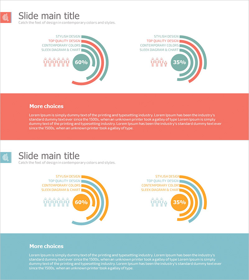
A donut chart PowerPoint slide designed for customer ratio analysis and market competitiveness visualization. This 2-slide template features multi-layer donut graphs in coral and teal color schemes, displaying specific percentages (60%, 35%) with integrated people icons and text labels. The layout combines data-driven design with clear information hierarchy, making it ideal for business presentations, quarterly reports, and marketing strategy decks. Fully editable PPTX format for immediate customization.
Usage Points
-
Main Usage
Visualize customer distribution, market share, and competitive positioning using multi-layer donut charts. The layered structure allows simultaneous representation of multiple ratio levels, while integrated percentage labels and people icons enhance data readability and audience engagement.
-
How to Use
Use in business reports, marketing strategy presentations, and investor pitch decks to explain customer segmentation and market analysis. Edit the donut layers, percentages, and labels to match your data. Customize background colors and text formatting to align with your brand guidelines.
-
Recommended For
Marketing managers, executives, data analysts, and sales teams presenting market analysis, customer insights, and competitive comparisons. Particularly suitable for B2B proposals, quarterly performance reports, and customer segmentation strategy presentations.
-
Slide Structure
2-slide layout with 2 donut charts per slide. Each donut comprises 3-4 concentric layers representing different data categories. Central percentage display (60%, 35%) serves as the focal point, with people icons on the left and text labels on the right for balanced visual composition.
Related Products
-

Drug Addiction Risk Analysis Graph Chart – Insightful Information Delivery
#Market and Competitor Analysis #Diagram #Graph
-

Service Sector Development Status Graph – Visualizing Competitive Edge with Doughnut Chart
#Product/Service Introduction #Market and Competitor Analysis #Graph
-

Gender Surgery Comparison Analysis Graph – Understanding Markets and Competitive Edge
#Market and Competitor Analysis #Graph #Other
-

Old Man Silhouette Donut Circle Graph – Customer Analysis
#Market and Competitor Analysis #Graph #Other
