Goal Setting & Radial Graph – Intuitive Data Visualization
RJ0300076_15
- Last Update 05/10/2025
- File Size 0.5MB
- # of Slides 2
- File Format PPTX
- Slide Ratio 16:9
- Color
Keywords
- #Content-Based Slides
- #Design-Based Slides
- #Business Introduction
- #Market and Competitor Analysis
- #Diagram
- #Graph
- #Technological Status
- #Market Analysis
- #Table
- #Other
- #Standard Table
- #Radar Chart Spider Chart
- #16:9
- #radial diagram PowerPoint
- #radial graph slide template
- #5-item comparison chart
- #goal analysis presentation
- #data visualization PowerPoint slide
About the Product
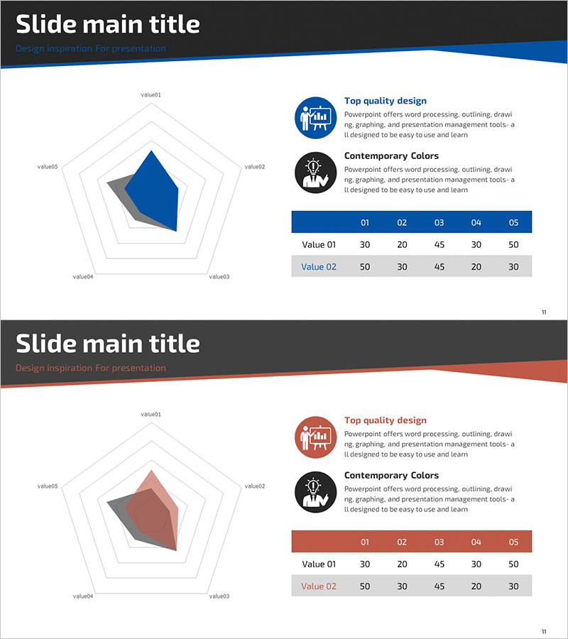
A 5-item radial diagram PowerPoint slide designed for goal setting and performance analysis. The structure radiates from a central core point outward in five directions, enabling intuitive comparison of each metric's value. Two color versions—blue tone and red tone—are included, complemented by a horizontal bar chart and data table that reinforce quantitative insights. This slide composition is immediately applicable to business status reviews, competitive analysis, technology capability assessments, and other presentation scenarios.
Usage Points
-
Main Usage
Displays multi-dimensional data through a radial structure that expands from a central core to five directional axes, enabling simultaneous comparison of each metric. This design effectively presents strengths, weaknesses, and current status across multiple dimensions to support comprehensive decision-making.
-
How to Use
Enter item names and values into the radial diagram, then mirror the same data in the accompanying horizontal bar chart and data table for visual consistency. Select either the blue or red version to match your presentation theme and tone.
-
Recommended For
Ideal for business strategy presentations, executive reports, marketing analysis, technology capability reviews, and organizational diagnostics. Recommended for goal achievement tracking, competitive benchmarking, product feature evaluation, team capability assessment, and any presentation requiring five-point comparative analysis.
-
Slide Structure
Both slides follow identical layout: central radial diagram with 5 nodes and 5 axis lines radiating outward, two explanatory icons with text in upper right, horizontal bar chart with 5 items and 2 data series in middle right, and data table (2 rows × 5 columns) in lower right. Only color scheme differs between blue and red versions.
Related Products
-

Online Shopping Mall System Radial Graph – Dynamic Data Visualization
#Business Introduction #Market and Competitor Analysis #Graph
-

Green Yellow Data Analysis Chart – Market and Competitive Analysis
#Business Introduction #Market and Competitor Analysis #Diagram
-

Big Data Development Status Radial Graph – Captivating Visual Appeal
#Product/Service Introduction #Business Introduction #Diagram
-

Business Plan Presentation Template - Radial Diagram & Table
#Market and Competitor Analysis #Financial Plans and Performance #Diagram
