Profit Analysis Graph – Visualizing Financial Performance
RJ0300070_27
- Last Update 05/08/2025
- File Size 0.1MB
- # of Slides 2
- File Format PPTX
- Slide Ratio 16:9
- Color
Keywords
- #Content-Based Slides
- #Design-Based Slides
- #Financial Plans and Performance
- #Diagram
- #Income Statement
- #Sales and Revenue
- #Table
- #Standard Table
- #16:9
- #horizontal bar chart PowerPoint
- #financial analysis slide template
- #revenue comparison graph
- #table data visualization
- #income statement PPT template
About the Product
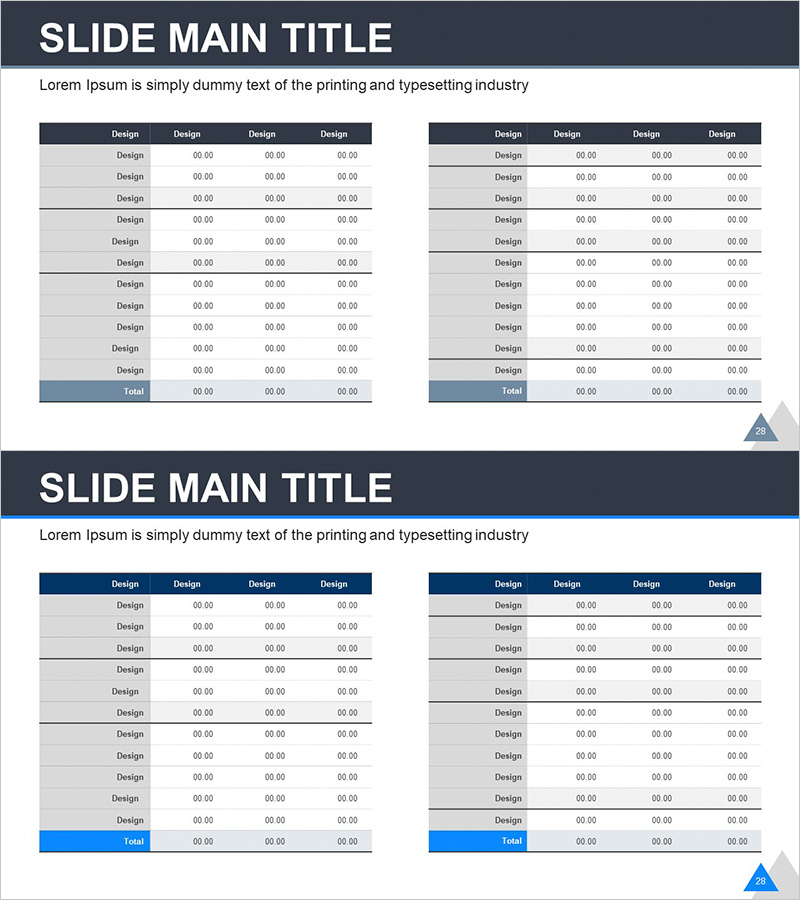
A professional horizontal bar chart PowerPoint slide designed to visualize financial performance and revenue analysis. The slide features a dark gray header row with four columns and light gray data rows, enabling side-by-side comparison of revenue metrics across multiple categories. Ideal for income statements, sales analysis, and financial planning presentations. This fully editable PPT slide automatically updates when you input numerical data. Includes 2 slides in 16:9 widescreen format.
Usage Points
-
Main Usage
Clearly present financial performance data in a side-by-side comparison structure, enabling stakeholders to quickly understand revenue trends, departmental performance, year-over-year sales comparisons, and other critical financial metrics at a glance.
-
How to Use
Enter actual revenue figures directly into the table cells, and the chart automatically updates. Use this slide in financial reporting sections, quarterly performance reviews, investor presentations, business analysis meetings, and financial planning documents.
-
Recommended For
CFOs, financial managers, executives, and business analysts presenting financial reports, investor relations pitches, quarterly earnings reviews, bank loan applications, and management consulting financial analyses.
-
Slide Structure
Both slides feature identical layouts with a dark gray header row (4 columns), light gray data rows (10 rows), and a blue-highlighted Total row. Two comparison tables are positioned side-by-side on each slide, facilitating easy data analysis and comparison.
Related Products
-

Visualizing Projected Income, Expenses, and Key Metrics by Business
#Financial Plans and Performance #Diagram #Text Box
-

Business Income Statement – Visualizing Financial Performance
#Financial Plans and Performance #Diagram #Income Statement
-

Sleek Infographic: Modern Colors and Chart Slide Design
#Financial Plans and Performance #Diagram #Income Statement
-

Business Income Statement Table – An Essential Tool for Performance Analysis
#Financial Plans and Performance #Diagram #Income Statement
