Company Service Analysis Graph – A Snapshot of Market Trends
RJ0300070_22
- Last Update 05/08/2025
- File Size 0.1MB
- # of Slides 2
- File Format PPTX
- Slide Ratio 16:9
- Color
Keywords
- #Content-Based Slides
- #Design-Based Slides
- #Market and Competitor Analysis
- #Financial Plans and Performance
- #Graph
- #Market Share
- #Market Analysis
- #Capital Requirements
- #Column
- #Segmented Column
- #16:9
- #vertical stacked bar chart PowerPoint
- #cumulative bar graph slide
- #market analysis chart template
- #year-over-year comparison slide
- #how to create bar chart in PowerPoint
About the Product
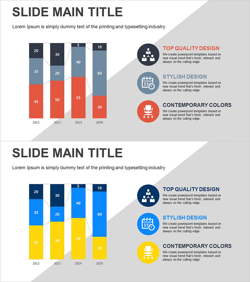
A vertical stacked bar chart PowerPoint slide designed to visualize company service analysis and market trends. This presentation template displays data across four years (2012, 2013, 2014, 2030) with four data series per year, enabling simultaneous comparison of annual progression and item-by-item growth rates. The slide features a three-color palette (gray, red, blue) in the first variant and blue-yellow in the second, with three circular icons positioned on the right to highlight key insights. Ideal for competitive analysis, market research presentations, and service performance reports that require immediate deployment.
Usage Points
-
Main Usage
The primary objective is to present year-over-year and item-by-item data comparisons with trend analysis at a glance. The stacked bar format simultaneously displays total volume and compositional proportions, making it highly effective for communicating market size evolution, service revenue trends, and competitive market share shifts.
-
How to Use
The template includes two slide variants: the first uses a gray-red-blue color scheme, while the second employs blue and yellow tones. Select the color variant that aligns with your presentation theme and brand identity, then input your data values for immediate use. Enhance the visual impact by adding key messages to the circular icon areas on the right side of the slide.
-
Recommended For
Recommended for executives, marketing teams, sales departments, and strategic planning units presenting market analysis, business performance reports, and competitive positioning. Particularly suited for investor presentations, executive briefings, and client proposals where quarterly or annual growth rates require emphasis.
-
Slide Structure
Each slide comprises a title section, a stacked vertical bar chart displaying four years of data (2012, 2013, 2014, 2030) with four data series per year, and three circular icon areas on the right for key messaging. Optimized for 16:9 widescreen format with fully editable text and numerical values throughout.
Related Products
-

Market Share Analysis with Horizontal Bar Chart – Harmonizing Blue and Red
#Market and Competitor Analysis #Graph #Market Share
-

Stacked Chart of Segmented Portfolio Contributions – A Powerful Tool for Business Strategy
#Business Strategy #Market and Competitor Analysis #Graph
-

Segmented Analysis of Interior Trends – Data Visualization for Market Analysis
#Market and Competitor Analysis #Financial Plans and Performance #Graph
-

Vertical Bar Chart Visualizing Monthly Performance – Contemporary Design
#Product/Service Introduction #Market and Competitor Analysis #Graph
