Comparative Analysis Detailed Bar Graph – Optimal Tool for Competitor Analysis
RJ0300069_7
- Last Update 05/07/2025
- File Size 0.7MB
- # of Slides 2
- File Format PPTX
- Slide Ratio 16:9
- Color
Keywords
- #Content-Based Slides
- #Design-Based Slides
- #Market and Competitor Analysis
- #Graph
- #Competitor Analysis
- #Competitive Advantage
- #Horizontal Bar
- #Segmented Horizontal Bar
- #16:9
- #segmented bar chart PowerPoint
- #horizontal bar graph template
- #comparative analysis slide
- #competitor analysis chart
- #dual-series bar chart PowerPoint slide
About the Product
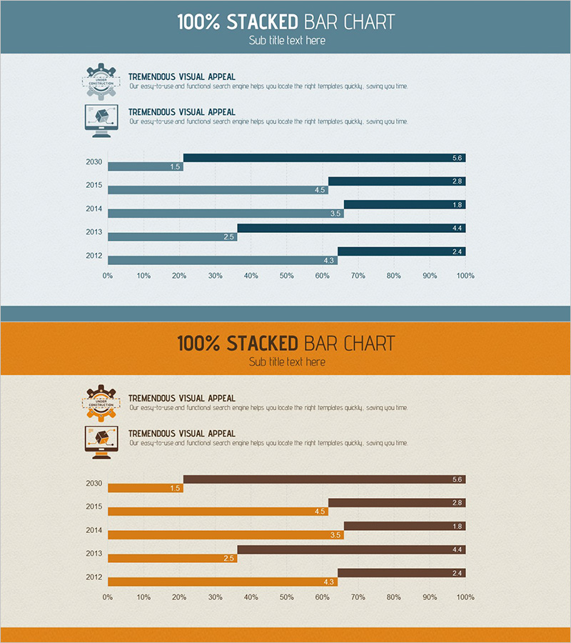
A segmented horizontal bar chart PowerPoint slide designed for competitive analysis and market comparison presentations. This slide template displays two data series side-by-side, enabling clear item-by-item numerical comparison across multiple years. The design uses slate blue and dark navy dual-tone color scheme to distinguish data series, with numerical labels positioned at the end of each bar for precise information delivery. Spanning 2012 to 2030, the chart allows year-over-year trend analysis at a glance. This presentation template is ready for immediate use in business reports, marketing strategy decks, and executive briefings.
Usage Points
-
Main Usage
Presents two data series in parallel arrangement to clearly express item-by-item numerical comparisons. Ideal for competitive performance benchmarking, market share analysis, and year-over-year revenue trends. The visual design enables audiences to instantly recognize data differences through bar length and numerical labels.
-
How to Use
Insert into the market analysis section of business reports, competitive landscape pages in marketing strategy decks, or performance comparison slides in executive presentations. The bar length and numerical labels ensure immediate audience comprehension of numerical differences, while the dual-color scheme provides clear series distinction without additional legend explanation.
-
Recommended For
Marketing managers, business strategy teams, financial analysts, and management consultants who regularly present quantitative comparative data. Applicable to quarterly and annual performance reviews, product line sales comparisons, regional performance analysis, and multi-year trend presentations across various business scenarios.
-
Slide Structure
Two-slide set featuring a slate blue header background on the first slide with title, descriptive text, and two icon elements. The second slide presents six years of data (2012–2030) in dual-series horizontal bars (slate blue and dark navy), with numerical labels (ranging 1.5–6.6) positioned at bar endpoints. Formatted in 16:9 widescreen aspect ratio for optimal projection compatibility.
Related Products
-

Competitor Analysis 3D Graph Slide – How to Gain Market Advantage
#Market and Competitor Analysis #Graph #Competitor Analysis
-

Big Data Field Analysis Graph – Horizontal Bar Chart Showing Competitive Advantage
#Market and Competitor Analysis #Graph #Competitor Analysis
-

Music Competitive Advantage Graph for Strategic Analysis
#Market and Competitor Analysis #Graph #Competitor Analysis
-

Comparison Bar Graph of Two Topics – Essential Template for Market Analysis
#Market and Competitor Analysis #Graph #Competitor Analysis
