Comparison Bar Graph of Two Topics – Essential Template for Market Analysis
RJ0900005_6
- Last Update 08/17/2025
- File Size 0.8MB
- # of Slides 2
- File Format PPTX
- Slide Ratio 16:9
- Color
Keywords
- #Content-Based Slides
- #Design-Based Slides
- #Market and Competitor Analysis
- #Graph
- #Competitor Analysis
- #Competitive Advantage
- #Horizontal Bar
- #Segmented Horizontal Bar
- #16:9
- #horizontal bar chart PowerPoint
- #comparison bar graph slide
- #market analysis PowerPoint
- #competitive analysis chart
- #2-item comparison slide
- #bar chart template download
About the Product
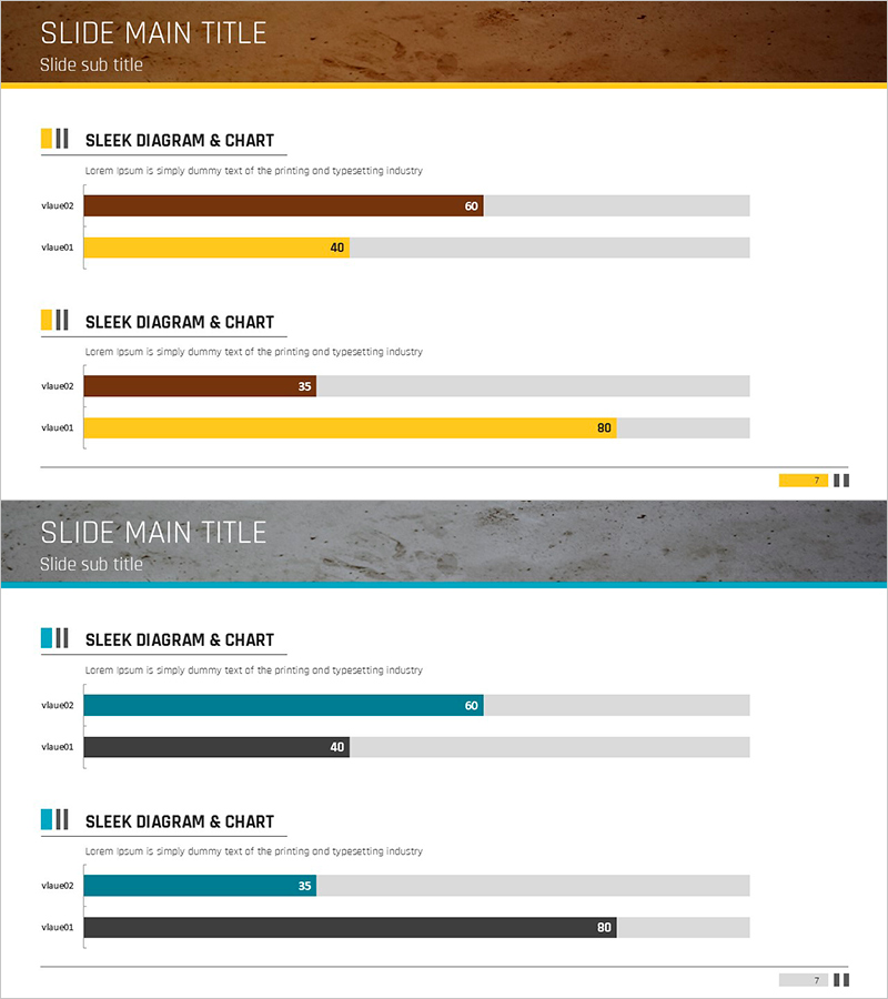
A horizontal bar chart PowerPoint slide optimized for market analysis and competitive comparison. Featuring a brown and yellow dual-tone color scheme, this slide enables side-by-side comparison of two data items with clear numerical values ranging from 0 to 100. Each bar displays both labels and values for easy data interpretation. This presentation template is ready to use in business reports, marketing plans, competitive analysis decks, and corporate presentations.
Usage Points
-
Main Usage
Visually compare and contrast two data items side by side. Effectively displays quantitative metrics such as market share, sales volume, or performance indicators, allowing audiences to instantly recognize differences between the two subjects.
-
How to Use
Replace the displayed values and labels with your own data. Adjust the length of the brown and yellow bars to reflect your comparison figures, and modify the title and legend as needed to match your presentation context.
-
Recommended For
Marketing professionals, sales managers, financial analysts, consultants, and business strategists presenting market conditions, competitive benchmarking, or performance comparisons. Ideal for business reports, investor presentations, strategy meetings, and client proposals.
-
Slide Structure
Two-slide set, each featuring a horizontal bar chart comparing two items. Bars are rendered in brown and yellow against a gray background, with numerical values displayed at the bar ends (60, 40, 35, 80, etc.). A title area at the top allows you to specify the chart subject.
Related Products
-

Comparative Analysis Detailed Bar Graph – Optimal Tool for Competitor Analysis
#Market and Competitor Analysis #Graph #Competitor Analysis
-

Competitor Analysis 3D Graph Slide – How to Gain Market Advantage
#Market and Competitor Analysis #Graph #Competitor Analysis
-

Music Competitive Advantage Graph for Strategic Analysis
#Market and Competitor Analysis #Graph #Competitor Analysis
-

Big Data Field Analysis Graph – Horizontal Bar Chart Showing Competitive Advantage
#Market and Competitor Analysis #Graph #Competitor Analysis
