Compass Shape Circle Graph – Optimal Choice for Market and Competitor Analysis
RJ0300069_19
- Last Update 05/07/2025
- File Size 0.7MB
- # of Slides 2
- File Format PPTX
- Slide Ratio 16:9
- Color
Keywords
- #Content-Based Slides
- #Design-Based Slides
- #Market and Competitor Analysis
- #Graph
- #Market Analysis
- #Circles
- #Doughnut Chart
- #16:9
- #pie chart PowerPoint slide
- #donut chart template
- #market analysis presentation
- #competitive analysis slide
- #data visualization PPT
- #ratio chart design
- #how to create pie chart in PowerPoint
About the Product
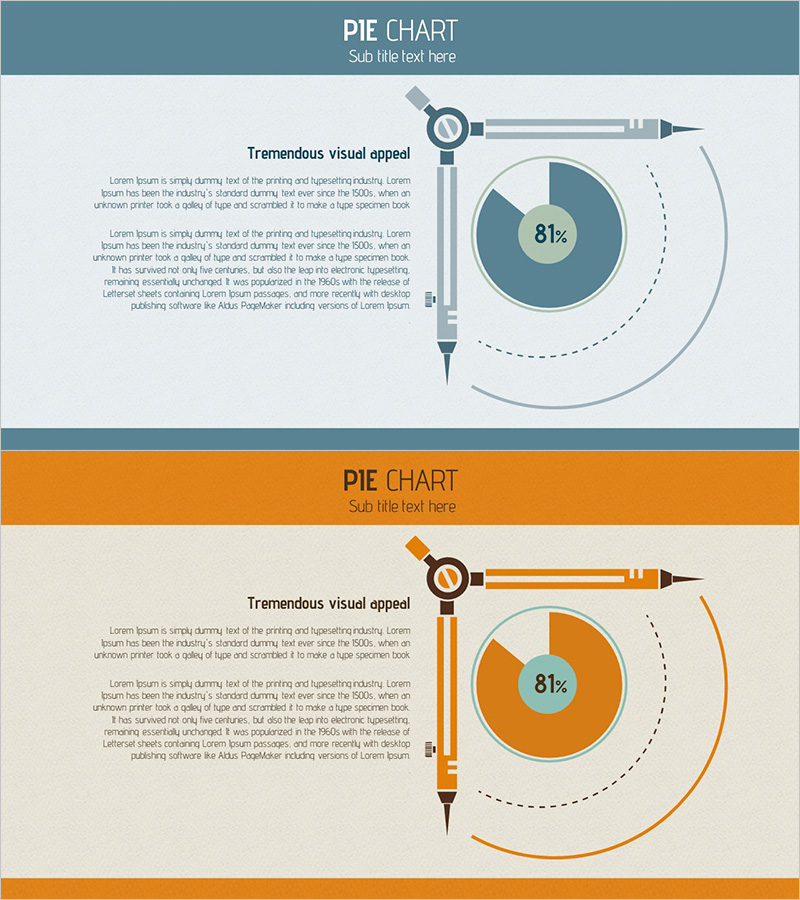
A pie chart PowerPoint slide optimized for market analysis and competitive comparison, featuring a compass-shaped pointer design. Available in two color schemes—slate blue and orange—with a donut-style chart structure emphasizing the central 81% metric. The left-side pointer icon and directional arrow visually convey data orientation, while the right text area accommodates detailed analysis. Designed in 16:9 widescreen format with 2 fully editable slides ready for immediate presentation use.
Usage Points
-
Main Usage
Highlights single-metric ratio data such as market share, competitor positioning, or achievement rates. The compass pointer icon visually communicates analytical direction and strategic focus, while the donut chart's central figure emphasizes the primary KPI.
-
How to Use
Enter analysis context and interpretation in the left text area, then customize the chart values and colors to match your data. Adjust the pointer icon and arrow direction as needed, and use the right-side circular element for supplementary information.
-
Recommended For
Marketing managers, strategy planners, sales leaders, and executive presentations. Ideal for quarterly performance reviews, market entry strategies, and competitive positioning pitches.
-
Slide Structure
Two-slide set featuring a donut-style pie chart (single series with centered metric), left-side pointer icon with directional arrow (orientation emphasis), text input area (analysis content), and right-side circular element (supplementary data). Includes both slate blue and orange color variants.
Related Products
-

Shareholder Status Survey Donut Graph – Optimized for Market Analysis
#Company Introduction #Market and Competitor Analysis #Diagram
-

Status Analysis Donut Chart – Shareholder Status Analysis
#Company Introduction #Market and Competitor Analysis #Diagram
-

Shareholder Status Analysis Chart & Description – Sleek Diagram
#Company Introduction #Market and Competitor Analysis #Diagram
-

Shareholder Status Analysis Slide – Data-Driven Market Insights
#Company Introduction #Market and Competitor Analysis #Diagram
