Competitive Advantage Broken Line Graph – Market and Competition Analysis
RJ0300069_18
- Last Update 05/07/2025
- File Size 0.8MB
- # of Slides 2
- File Format PPTX
- Slide Ratio 16:9
- Color
Keywords
- #Content-Based Slides
- #Design-Based Slides
- #Market and Competitor Analysis
- #Graph
- #Competitor Analysis
- #Competitive Advantage
- #Line
- #Line Chart
- #16:9
- #line chart PowerPoint
- #multi-series chart template
- #trend comparison slide
- #market analysis graph
- #competitive analysis PowerPoint slide
- #data visualization presentation
About the Product
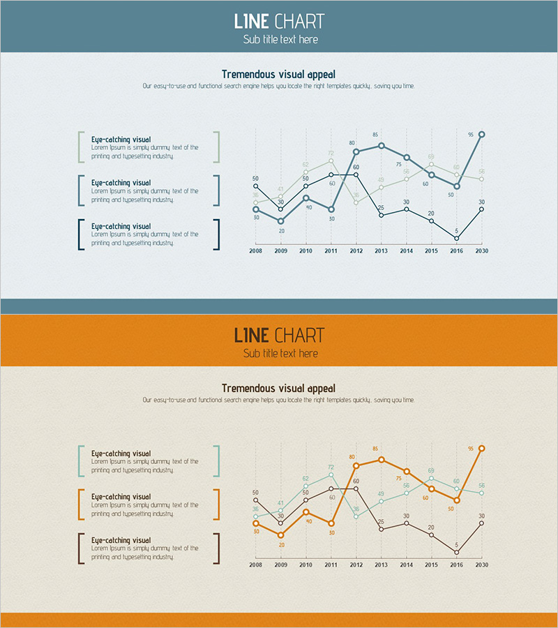
A PowerPoint slide featuring a multi-series line chart displaying data trends from 2008 to 2020 across three distinct data series. The chart uses blue, orange, and black line colors to clearly differentiate between each series, making comparative analysis straightforward. The left side includes three text boxes for highlighting key insights, while each data point is labeled with numerical values for precise reference. This presentation template is ready to use for market analysis, competitive benchmarking, performance reporting, and business intelligence presentations.
Usage Points
-
Main Usage
Visualize and compare multiple data series over time on a single slide. Ideal for displaying competitive performance metrics, market share evolution, revenue trends, and other multi-indicator analyses that require side-by-side comparison.
-
How to Use
Enter your three key analysis points in the left text boxes and replace the chart data with your actual figures. Customize line colors by company or category, and adjust the X-axis (years) and Y-axis (value range) to match your data. All elements are fully editable in PowerPoint.
-
Recommended For
Executive presentations, quarterly and annual performance reviews, competitive benchmarking reports, market research findings, investor pitch decks, and sales team presentations. Recommended for any business presentation requiring 2-4 data series comparison.
-
Slide Structure
The slide layout includes a header section (title and subtitle) and a main content area. The left side features three vertically stacked text boxes for key points, while the right side displays a line chart spanning 2008-2020 with three color-coded series (blue, orange, black) and labeled data points for each year.
Related Products
-

Variation Graph for the Line Chart – Optimized Design for Market and Competitor Analysis
#Market and Competitor Analysis #Graph #Competitor Analysis
-

Competitor Idea Analysis Graph
#Market and Competitor Analysis #Graph #Competitor Analysis
-

Competition Graphs and Analysis – Slides for Market Advantage
#Market and Competitor Analysis #Graph #Competitor Analysis
-

Blue Green Broken Line Graph – Competitor Analysis
#Market and Competitor Analysis #Graph #Competitor Analysis
