Dot Map Graph for Market Analysis Visualization – Strategic Approach
RJ0300068_10
- Last Update 05/07/2025
- File Size 1.4MB
- # of Slides 2
- File Format PPTX
- Slide Ratio 16:9
- Color
Keywords
- #Content-Based Slides
- #Design-Based Slides
- #Market and Competitor Analysis
- #Marketing Plan and Strategy
- #Graph
- #Other
- #Target Market
- #Target Market Strategy
- #Other
- #Other Charts
- #Map
- #16:9
- #dot map PowerPoint slide
- #world map infographic template
- #regional data visualization
- #market analysis presentation
- #global statistics slide download
About the Product
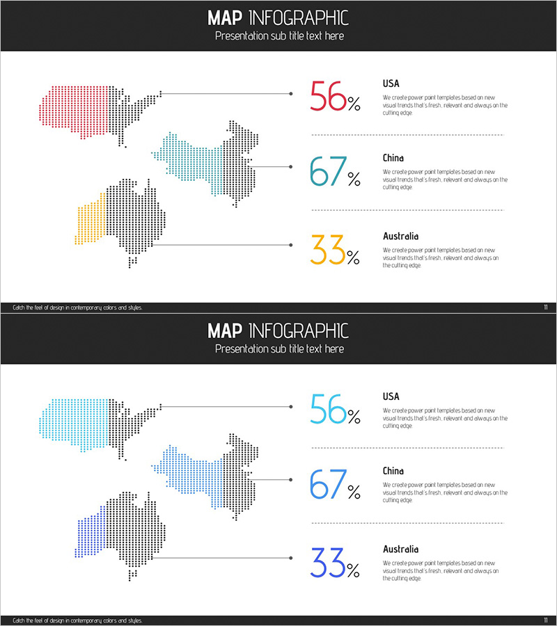
A world map visualization using dot patterns to represent geographic data with country-specific statistics displayed prominently. This PowerPoint slide compares three regions—USA, China, and Australia—with color-coded dot maps (red, blue, yellow) and percentage metrics (56%, 67%, 33%) for market share, sales performance, or customer distribution analysis. The 2-slide deck is optimized for 16:9 widescreen format and ready for immediate use in market analysis presentations, global business reports, and regional performance reviews. Dot colors and percentages are fully editable, allowing customization to match corporate branding and data updates.
Usage Points
-
Main Usage
Visualize global market distribution and regional performance metrics using color-coded dot maps paired with percentage data. This slide effectively communicates market share, sales volume, customer concentration, or growth rates across geographic regions. Ideal for executive presentations, investor pitches, and strategic planning sessions where quantitative regional comparisons drive decision-making.
-
How to Use
Insert into business plans, investment pitch decks, or marketing strategy presentations within the market analysis section. Modify dot colors to represent different time periods, quarters, or product lines for comparative analysis. During presentations, highlight percentage figures while explaining regional opportunities, competitive positioning, and strategic priorities tied to each geographic market.
-
Recommended For
Marketing, sales, and strategic planning teams presenting global market insights. Suitable for executive briefings, board meetings, investor relations presentations, international expansion proposals, and regional sales strategy reviews. Also effective in market research reports, competitive analysis documents, and cross-regional performance evaluations.
-
Slide Structure
Slide 1: Multi-color dot map (USA red, China blue, Australia yellow) with right-aligned percentage metrics (56%, 67%, 33%) and descriptive text labels. Slide 2: Monochrome blue dot map version of the same layout for print and grayscale presentation compatibility. Both slides use left-aligned map and right-aligned data to create clear visual hierarchy and information flow.
Related Products
-

Target Country Distribution Graph – Strategic Visualization for Market Analysis
#Market and Competitor Analysis #Marketing Plan and Strategy #Graph
-

Target Market Share Map Graph – Market Analysis and Strategy
#Market and Competitor Analysis #Marketing Plan and Strategy #Graph
-

US Target Market Map for Marketing Analysis
#Market and Competitor Analysis #Marketing Plan and Strategy #Graph
-

Slide Template for European Target Market Goals
#Market and Competitor Analysis #Marketing Plan and Strategy #Other
