Successful Data Analysis Donut Graph
RJ0300067_7
- Last Update 05/07/2025
- File Size 2.1MB
- # of Slides 2
- File Format PPTX
- Slide Ratio 16:9
- Color
Keywords
- #Content-Based Slides
- #Design-Based Slides
- #Product/Service Introduction
- #Market and Competitor Analysis
- #Graph
- #Development Status
- #Market Analysis
- #Circles
- #Doughnut Chart
- #16:9
- #donut chart PowerPoint slide
- #pie chart presentation template
- #data visualization PPT
- #ratio analysis slide
- #circular graph template download
About the Product
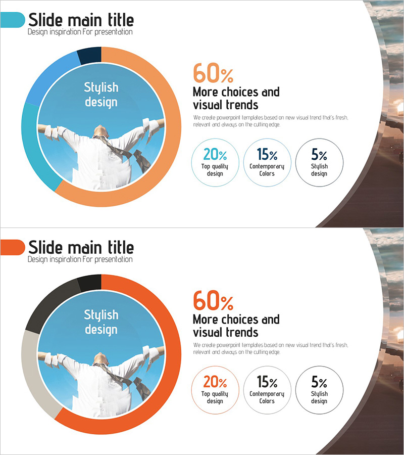
A donut chart PowerPoint slide optimized for data analysis and market reporting presentations. The design features a 4-segment donut graph in orange, blue, and black color palette, positioned alongside a central image area for maximum visual impact. This 2-slide set is formatted in 16:9 widescreen ratio and includes percentage badges (20%, 15%, 5%) to highlight key metrics. Each slide layout is fully editable, allowing you to customize chart segments, colors, and data values to match your presentation needs. Ideal for business reports, market analysis, financial summaries, and performance dashboards where proportional data visualization is essential. The central image zone accommodates logos, product photos, or icons to reinforce your message.
Usage Points
-
Main Usage
Visualize proportional data using a donut chart format that clearly shows each segment's percentage of the whole. The central image area allows you to insert logos, icons, or supporting visuals, while percentage badges on the right emphasize key metrics. Perfect for displaying market share, budget allocation, success factors, or component composition in business presentations.
-
How to Use
Edit the donut chart segments and percentages directly in PowerPoint to reflect your actual data. Replace the central image placeholder with your company logo, product photo, or relevant icon. Customize the percentage badges with your specific metrics or add descriptive labels. All elements are independently editable for maximum flexibility.
-
Recommended For
Executive reports, marketing strategy presentations, business analysis meetings, market research findings, financial performance reviews, customer satisfaction surveys, and product composition introductions. Recommended for executives, marketing teams, data analysts, sales professionals, and business consultants who need to communicate proportional insights effectively.
-
Slide Structure
2-slide template. Each slide features a title area at the top, a 4-segment donut chart on the left-center (orange, blue, black, and gray segments), a central image insertion zone, three percentage badges on the right (20%, 15%, 5%), and descriptive text area at the bottom-right. The second slide includes a color variation with enhanced black segments for alternative data representation.
Related Products
-

Development Analysis Donut Graph – Visual Data Presentation
#Product/Service Introduction #Market and Competitor Analysis #Graph
-

Development Status Analysis Chart - Visualization for Effective Market Analysis
#Product/Service Introduction #Market and Competitor Analysis #Diagram
-

Business Investment Market Analysis Donut Graph
#Product/Service Introduction #Market and Competitor Analysis #Diagram
-

Market Environment Analysis Chart – A Visual Indicator for Data Analysis
#Product/Service Introduction #Market and Competitor Analysis #Diagram
