Customer Analysis Line Graph – Visualizing Market Insights
RJ0300067_22
- Last Update 05/07/2025
- File Size 1.1MB
- # of Slides 2
- File Format PPTX
- Slide Ratio 16:9
- Color
Keywords
- #Content-Based Slides
- #Design-Based Slides
- #Market and Competitor Analysis
- #Graph
- #Customer Analysis
- #Market Analysis
- #Line
- #Other
- #Line Chart
- #Other Charts
- #16:9
- #customer analysis line graph
- #market trend chart PowerPoint
- #business insight presentation
- #data visualization slide
- #customer analytics template
About the Product
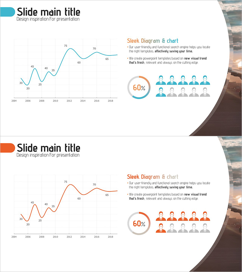
A comprehensive PowerPoint slide deck visualizing customer data trends over 15 years using a multi-element layout. The design combines a line graph tracking market performance from 2004 to 2018, a 60% donut chart highlighting key metrics, and a team composition icon set showing 10 members. The teal and orange color contrast emphasizes data hierarchy and maintains visual balance across the presentation. This 16:9 widescreen format includes 2 fully editable slides suitable for business reports, investor presentations, and quarterly performance reviews. All chart elements, text, and icons can be customized to match your specific data and corporate branding.
Usage Points
-
Main Usage
Effectively communicate long-term customer behavior patterns and market performance trends through integrated data visualization. The line graph displays numerical fluctuations clearly, while the pie chart and team icons provide supporting context for comprehensive data storytelling.
-
How to Use
Insert into quarterly business reports, marketing strategy presentations, investor pitch decks, and performance analysis documents. Replace sample data with your actual figures; the chart automatically updates. Adjust colors and fonts to align with corporate brand guidelines and presentation themes.
-
Recommended For
Marketing managers, business analysts, executives, and sales leaders presenting customer segment analysis and market performance metrics. Ideal for strategy meetings and board presentations requiring data-driven decision-making with credible visual evidence.
-
Slide Structure
Slide 1: 15-point line graph (teal) spanning 2004–2018, 60% donut chart (orange accent), 10-member team icon set (5 active, 5 inactive). Slide 2: Identical layout with orange line graph variant for color contrast options.
Related Products
-

User Analysis Results Diagram - Infographic for Customer Insights
#Market and Competitor Analysis #Graph #Other
-

Consumer Insights & Behavioral Patterns Analysis Slide
#Market and Competitor Analysis #Graph #Market Status
-

Orange Green Customer Analysis and Bell Chart
#Market and Competitor Analysis #Graph #Other
-

Customer Analysis Diagram & Segmentation Graph – In-depth Market Insights
#Market and Competitor Analysis #Graph #Customer Analysis
