Doughnut Chart for System Development Status Progress Visualization
RJ0300063_29
- Last Update 05/05/2025
- File Size 4.3MB
- # of Slides 2
- File Format PPTX
- Slide Ratio 16:9
- Color
Keywords
- #Content-Based Slides
- #Design-Based Slides
- #Product/Service Introduction
- #Market and Competitor Analysis
- #Graph
- #Development Status
- #Market Share
- #Circles
- #Other
- #Doughnut Chart
- #Other Charts
- #16:9
- #doughnut chart PowerPoint
- #pie chart slide template
- #circular graph presentation
- #ratio visualization slide
- #4-segment chart download
- #progress tracking PPT
About the Product
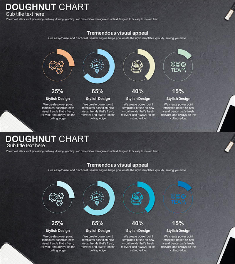
A doughnut chart PowerPoint slide designed to display system development progress, project completion rates, task allocation percentages, and other 4-segment ratio data. Set against a dark gray background, the chart uses four distinct colors—orange, blue, beige, and green—to differentiate each segment, with a central circular area for highlighting key metrics. Percentage values and descriptive text fields are positioned below each segment for immediate presentation use. The 2-slide 16:9 widescreen format accommodates various ratio-based data visualization needs.
Usage Points
-
Main Usage
Visualize the proportional relationships of 4 items—such as project progress, system development status, task allocation, budget distribution, or market share—in a single doughnut chart. The central circular area emphasizes core messages or aggregate figures, supporting data-driven decision-making in executive presentations.
-
How to Use
Modify each doughnut segment's color and percentage to match your actual data, then enter item names and descriptions in the text fields below. Use in management reports, project kickoffs, quarterly performance reviews, investor presentations, and other settings where quantitative data communication is essential.
-
Recommended For
System development teams, project managers, executives, marketing professionals, financial analysts, and other roles requiring data-driven status reporting. Particularly effective when presenting ratio data composed of 4 or fewer categories with clarity and impact.
-
Slide Structure
2-slide set featuring a multi-color doughnut chart (orange, blue, beige, green) on the first slide and a blue-toned single-color doughnut chart on the second. Each slide displays 4 segments with percentage values and descriptive text areas below, plus title and subtitle input spaces at the top for customization.
Related Products
-

Business Development Status Analysis Graph – Key Insight Visualization
#Product/Service Introduction #Market and Competitor Analysis #Graph
-

Graph of Analysis of Transportation Development Status
#Product/Service Introduction #Market and Competitor Analysis #Graph
-

Analysis of Transportation Usage Status – Pie Chart
#Product/Service Introduction #Market and Competitor Analysis #Graph
-

Analysis graph of market share progress
#Product/Service Introduction #Market and Competitor Analysis #Graph
