Visualizing Work Progress Status by Job with Doughnut Chart
RJ0300023_22
- Last Update 04/23/2025
- File Size 0.3MB
- # of Slides 2
- File Format PPTX
- Slide Ratio 16:9
- Color
Keywords
- #Content-Based Slides
- #Design-Based Slides
- #Product/Service Introduction
- #Market and Competitor Analysis
- #Graph
- #Development Status
- #Market Share
- #Circles
- #Doughnut Chart
- #16:9
- #doughnut chart PowerPoint
- #pie chart slide template
- #ratio comparison presentation
- #work progress visualization
- #donut chart download
- #PowerPoint graph slide design
About the Product
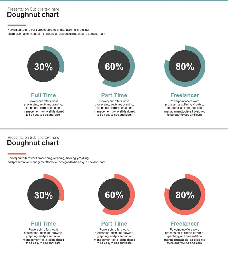
A 2-slide PowerPoint presentation set visualizing work progress status by job role using doughnut charts. Includes two color versions—teal and red series—each displaying ratio comparisons for three items. The center circular area accommodates key metrics or percentages, making it ideal for quantitative data presentation. Instantly applicable to full-time vs. part-time vs. freelancer classifications, project completion rates, resource allocation, and other comparative data in business reports and team updates.
Usage Points
-
Main Usage
Communicate job-based workload distribution, project completion rates, and resource allocation ratios at a glance using doughnut charts. The center circular area emphasizes key metrics or percentages, enabling clear comparison of three-item composition and data-driven decision-making.
-
How to Use
Select the appropriate color version (teal or red) based on presentation theme or corporate branding. Edit chart values, labels, and percentages to reflect actual data. Customize item names and metrics as needed for immediate deployment in reports and presentations.
-
Recommended For
Ideal for executive reports, business performance presentations, organizational structure updates, project status meetings, and marketing campaign analysis. Recommended for planners, analysts, project managers, and executives who need to present quantitative ratio data effectively.
-
Slide Structure
Slide 1: Three teal doughnut charts (30%, 60%, 80% sample ratios) with descriptive text areas per item. Slide 2: Three red doughnut charts with identical layout. Each chart features an editable center circle for metrics and outer arcs representing proportional values.
Related Products
-

Stock Market Share Analysis Graph – Insights and Strategies
#Product/Service Introduction #Market and Competitor Analysis #Graph
-

City Theme Market Share Graph – Business Data Visualization
#Product/Service Introduction #Market and Competitor Analysis #Graph
-

Doughnut Chart Visualizing Current Status of 3D Printing Technology Development
#Product/Service Introduction #Market and Competitor Analysis #Graph
-

Mobile App Market Share Analysis Graph
#Product/Service Introduction #Market and Competitor Analysis #Diagram
