Business Task Progress Analysis Graph – Real-time Data Visualization
RJ0300063_25
- Last Update 05/05/2025
- File Size 4.3MB
- # of Slides 2
- File Format PPTX
- Slide Ratio 16:9
- Color
Keywords
- #Content-Based Slides
- #Design-Based Slides
- #Product/Service Introduction
- #Market and Competitor Analysis
- #Diagram
- #Development Status
- #Market Share
- #Table
- #16:9
- #doughnut chart PowerPoint slide
- #dual metric comparison chart
- #data visualization PowerPoint
- #progress analysis slide
- #business performance chart template
About the Product
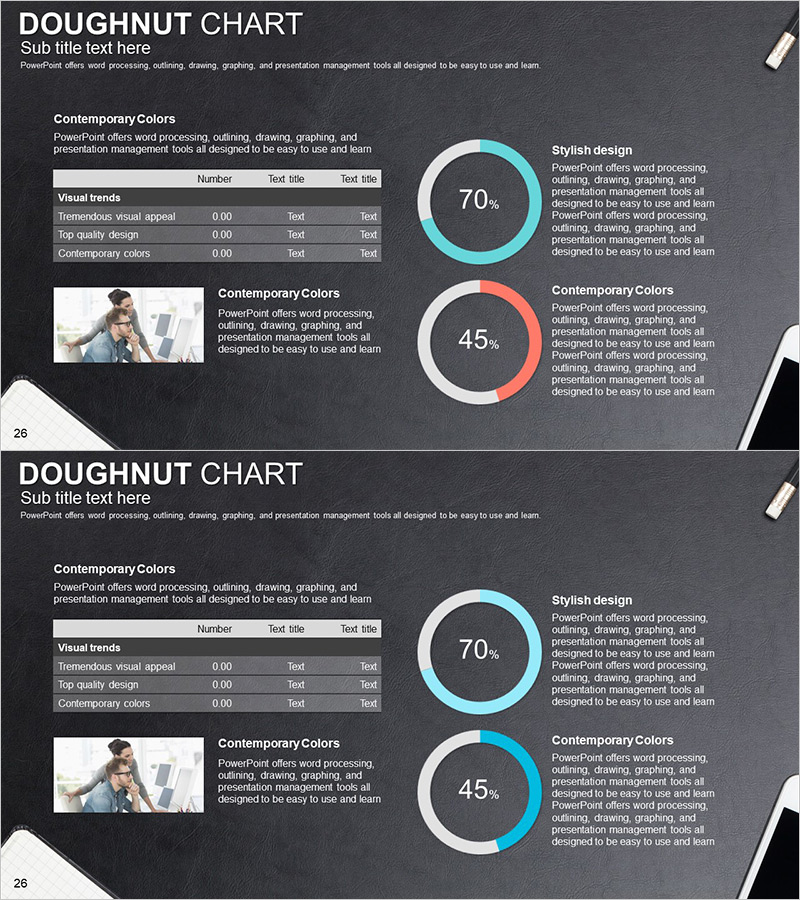
A professional doughnut chart PowerPoint slide designed for real-time business performance visualization and comparative analysis. The slide features two doughnut charts (70% and 45%) on a dark gray background with cyan and coral color accents, enabling simultaneous comparison of two key metrics. Each chart is accompanied by dedicated text areas for detailed explanations and insights. A data table with three rows and three columns is positioned on the left side for easy input of specific values and category labels. This slide set includes two variations, making it ideal for internal reports, executive briefings, project status updates, and performance dashboards in corporate presentations.
Usage Points
-
Main Usage
Display two critical performance indicators (such as goal achievement rate and quality score) side-by-side using doughnut charts for immediate comparative analysis. Provides objective data-driven insights to support executive decision-making and performance evaluation.
-
How to Use
Customize the percentage values and colors of each doughnut chart to represent project progress, quality metrics, revenue targets, or other KPIs. Input detailed data into the table, add analysis text in the right-side text boxes, and the slide is ready for presentation.
-
Recommended For
Executive briefings, weekly and monthly performance reports, project status presentations, departmental KPI reviews, investor updates, and any business presentation requiring quantitative data visualization and comparative analysis.
-
Slide Structure
The slide layout includes a title section, left-side data table (3 rows × 3 columns), two centered doughnut charts with percentage indicators, and right-side text explanation areas. The two-slide set provides identical layouts with variations, allowing flexible use for multiple metric comparisons across different reporting scenarios.
Related Products
-

Market Share Analysis Graph & Table – Enhancing Understanding through Data Visualization
#Product/Service Introduction #Market and Competitor Analysis #Diagram
-

Logistics Business Market Share Graph - Industry Insights and Data Visualization
#Product/Service Introduction #Market and Competitor Analysis #Diagram
-

Internet Shopping Market Analysis Chart
#Product/Service Introduction #Market and Competitor Analysis #Diagram
-

AI System Development Status Analysis Chart - Market Share and Key Metrics
#Product/Service Introduction #Market and Competitor Analysis #Diagram
