AI System Development Status Analysis Chart - Market Share and Key Metrics
RJ0400072_9
- Last Update 06/07/2025
- File Size 0.2MB
- # of Slides 2
- File Format PPTX
- Slide Ratio 16:9
- Color
Keywords
- #Content-Based Slides
- #Design-Based Slides
- #Product/Service Introduction
- #Market and Competitor Analysis
- #Diagram
- #Graph
- #Development Status
- #Market Share
- #Table
- #Circles
- #Doughnut Chart
- #16:9
- #doughnut chart PowerPoint
- #pie chart slide template
- #ratio comparison chart
- #market share visualization
- #data visualization slides
- #donut graph download
About the Product
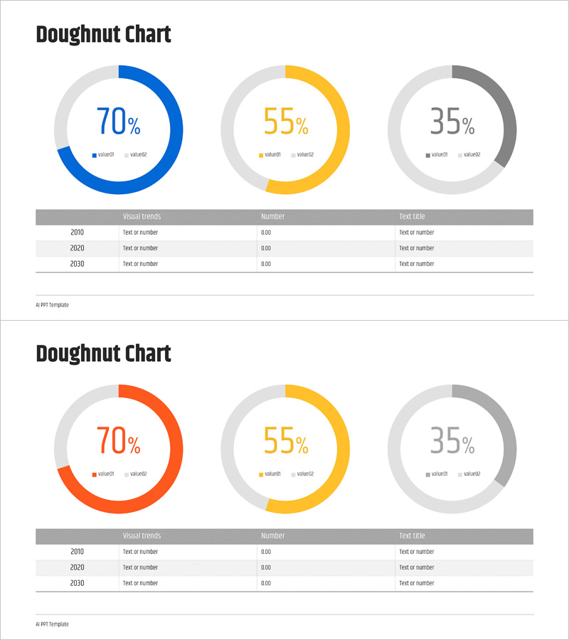
A PowerPoint slide featuring three doughnut charts side by side to visualize AI system development status and market share distribution. The charts are color-coded in blue, yellow, and gray, each displaying different percentage values (70%, 55%, 35%) to represent comparative data across categories or time periods. A data table below the charts provides space for year-over-year visual trends, numerical values, and descriptive text, enabling integrated presentation of quantitative metrics and qualitative analysis. Designed in 16:9 widescreen format with 2 fully editable slides, this template is ready for immediate use in corporate performance reports, market research presentations, technology status updates, investor pitches, and business analytics decks.
Usage Points
-
Main Usage
This slide enables simultaneous comparison of multiple data categories by ratio and illustrates trends across time periods or segments. The three doughnut charts positioned side-by-side allow viewers to compare the same metric across different years, departments, or product lines, while the integrated data table below reinforces findings with specific numbers and contextual explanations.
-
How to Use
Edit the colored segments and center percentages in each doughnut chart to reflect your actual data. Replace the legend labels (value01, value02) with your category names. Populate the table rows with corresponding years, visual trend descriptions, numerical values, and supporting text. During presentation, progress from left to right through each chart, explaining the significance of each metric before referencing the supporting data in the table below.
-
Recommended For
Technology and AI companies presenting development progress reports, marketing teams analyzing market share and competitive positioning, executive leadership presenting quarterly or annual performance metrics, investor relations teams explaining business results, consulting firms presenting client analysis findings, and academic researchers comparing multi-dataset results.
-
Slide Structure
Slide 1: Title area + 3 doughnut charts (blue 70%, yellow 55%, gray 35%) + bottom data table with rows for year, visual trends, numerical values, and text information. Slide 2: Identical layout with alternate color scheme (orange, yellow, gray) for doughnut charts + matching table. All shapes, text, colors, percentages, and legend labels are fully editable and customizable.
Related Products
-

Aerospace Industry Development Status Graph
#Product/Service Introduction #Market and Competitor Analysis #Graph
-

Blue Green Donut Circle Graph for Market Share Visualization - Market Analysis and Strategy
#Product/Service Introduction #Market and Competitor Analysis #Graph
-

Financial Business Analysis Pie Chart – Market Share Insights
#Product/Service Introduction #Market and Competitor Analysis #Graph
-

Fintech Development Status Graph – Market Share Analysis
#Product/Service Introduction #Market and Competitor Analysis #Graph
