Curved Area Graph for Market Trend Analysis – Vision and Growth
RJ0300058_31
- Last Update 05/03/2025
- File Size 3MB
- # of Slides 2
- File Format PPTX
- Slide Ratio 16:9
- Color
Keywords
About the Product
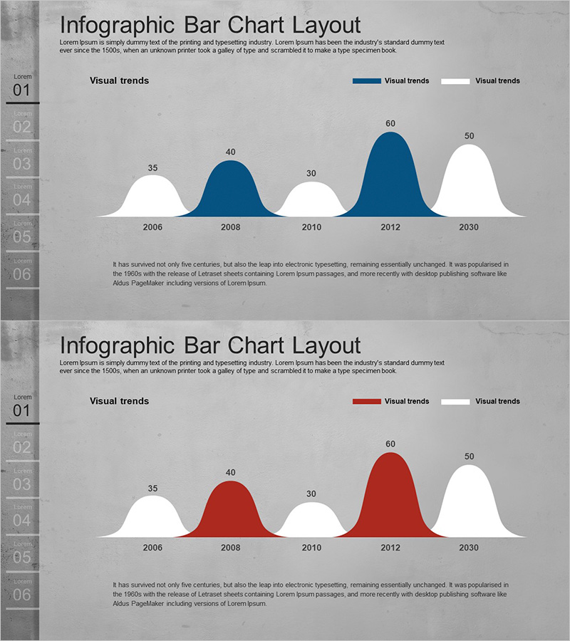
A curved area chart PowerPoint slide designed to visualize market trends and growth trajectories over time. This presentation template displays data across five key time points from 2006 to 2030, using navy blue and gray color schemes to distinguish primary metrics from comparative indicators. The smooth, flowing area chart format intuitively communicates trend changes and momentum, while the left-side numbering (01–06) and accompanying descriptive text create a natural narrative flow for your presentation. Ideal for business performance reports, market analysis sections, strategic vision presentations, and competitive landscape assessments.
Usage Points
-
Main Usage
Illustrate temporal changes in market size, revenue growth, customer acquisition, market share, or other key performance indicators through flowing area visualization. The dual-series overlay enables direct comparison between primary and secondary metrics, while explicit numerical labels (35, 40, 30, 60, 50) ensure precise data communication and audience comprehension.
-
How to Use
Deploy in business performance reports (market analysis section), investor pitch decks (demonstrating growth potential), marketing strategy presentations (market landscape overview), and executive briefings (trend analysis). Pair the chart with step-by-step explanations aligned to the left-side numbering to guide audience understanding through each data phase.
-
Recommended For
Executives, marketing managers, business development teams, financial analysts, management consultants, and strategy professionals requiring data-driven presentations. Particularly effective for quarterly/annual performance reviews, market entry strategy pitches, competitive benchmarking presentations, and investor relations communications.
-
Slide Structure
Two-slide template featuring curved area charts across five data points (2006, 2008, 2010, 2012, 2030). Each slide displays dual-series areas—navy blue for primary metrics and gray for comparison data—with overlapping visualization. Numerical labels appear above each data point for clarity. Optimized for 16:9 widescreen format with left-aligned numbering and supporting text blocks.
Related Products
-

Triangular Bar Graph for Future Outlook Analysis
#Market and Competitor Analysis #Graph #Future Outlook
-

User Gender Ratio Analysis Graph – Essential Tool for Market and Customer Analysis
#Market and Competitor Analysis #Graph #Other
-

Area Curve Graph for Market Analysis and Strategy Visualization
#Market and Competitor Analysis #Marketing Plan and Strategy #Graph
-

Country Analysis Map Graph for Market Insights
#Market and Competitor Analysis #Marketing Plan and Strategy #Graph
