Download History Analysis Graph – A Must for Data Visualization
RJ0300058_13
- Last Update 05/03/2025
- File Size 3MB
- # of Slides 2
- File Format PPTX
- Slide Ratio 16:9
- Color
Keywords
- #Content-Based Slides
- #Design-Based Slides
- #Product/Service Introduction
- #Market and Competitor Analysis
- #Graph
- #Development Status
- #Market Share
- #Circles
- #Doughnut Chart
- #16:9
- #donut chart PowerPoint slide
- #pie chart comparison template
- #data visualization slide
- #how to create donut chart in PowerPoint
- #two-item comparison slide download
About the Product
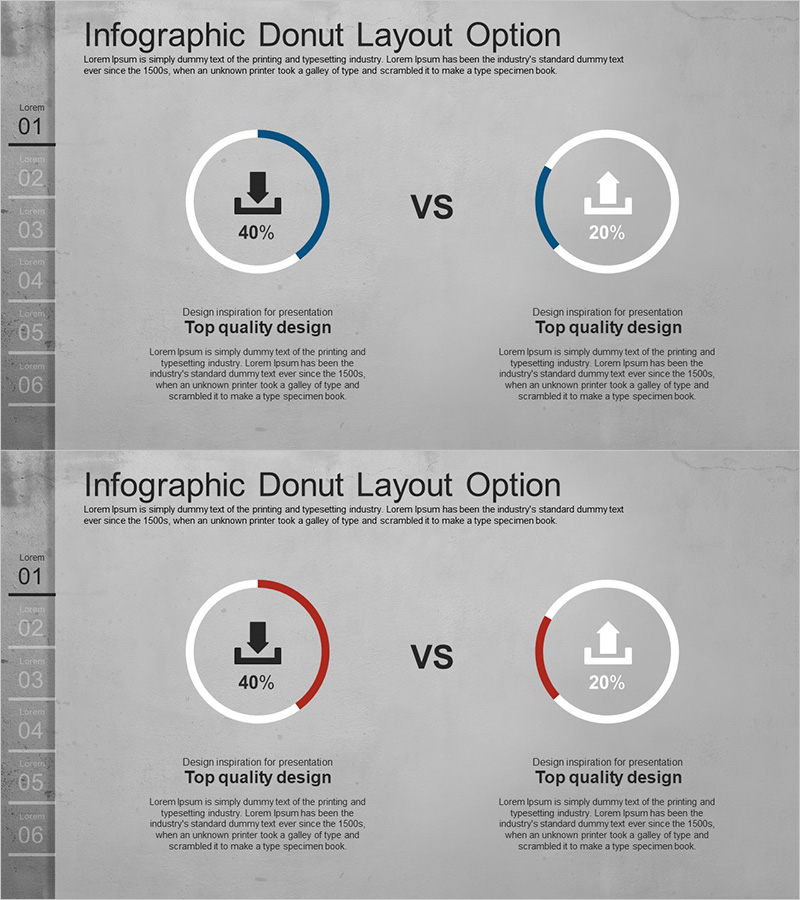
A PowerPoint slide featuring two donut charts side-by-side for comparing download metrics, market share, or competitive performance. The design uses a gray background with navy blue and red arc gauges, each displaying percentage values and icons in the center for intuitive data interpretation. A 'vs' label emphasizes the comparison relationship, while a numbered list (01–06) on the left indicates section structure. This data visualization slide is ready to use in presentations, reports, and analytical documents.
Usage Points
-
Main Usage
Designed to visually compare two metrics or categories with percentage values. Ideal for download rate vs. installation rate, market share vs. competitor share, target achievement vs. actual achievement, and any scenario requiring comparative analysis.
-
How to Use
Replace the percentage values and icons in each donut chart with your own data. Customize the arc gauge colors (navy, red) to match your brand palette, and edit the descriptive text below each chart to clarify the meaning of each metric.
-
Recommended For
Marketing professionals presenting market analysis, sales teams reporting performance comparisons, executive-level competitive analysis, consulting firms conducting benchmarking studies, and data analysts presenting insights.
-
Slide Structure
2-slide set. Each slide displays two donut charts (approximately 120px diameter) positioned left and right, with a 'vs' label in the center. Each chart contains a percentage value and icon (download, building, etc.) in the center. Includes a numbered list on the left and descriptive text area at the bottom.
Related Products
-

Sales Status Analysis Graph – Simple and Stylish Design
#Product/Service Introduction #Market and Competitor Analysis #Graph
-

Analysis graph of market share progress
#Product/Service Introduction #Market and Competitor Analysis #Graph
-

Financial Business Analysis Pie Chart – Market Share Insights
#Product/Service Introduction #Market and Competitor Analysis #Graph
-

Stock Market Share Analysis Graph – Insights and Strategies
#Product/Service Introduction #Market and Competitor Analysis #Graph
