User Analysis Status by Country – Insights and Vision
RJ0300052_12
- Last Update 05/02/2025
- File Size 4.4MB
- # of Slides 2
- File Format PPTX
- Slide Ratio 16:9
- Color
Keywords
About the Product
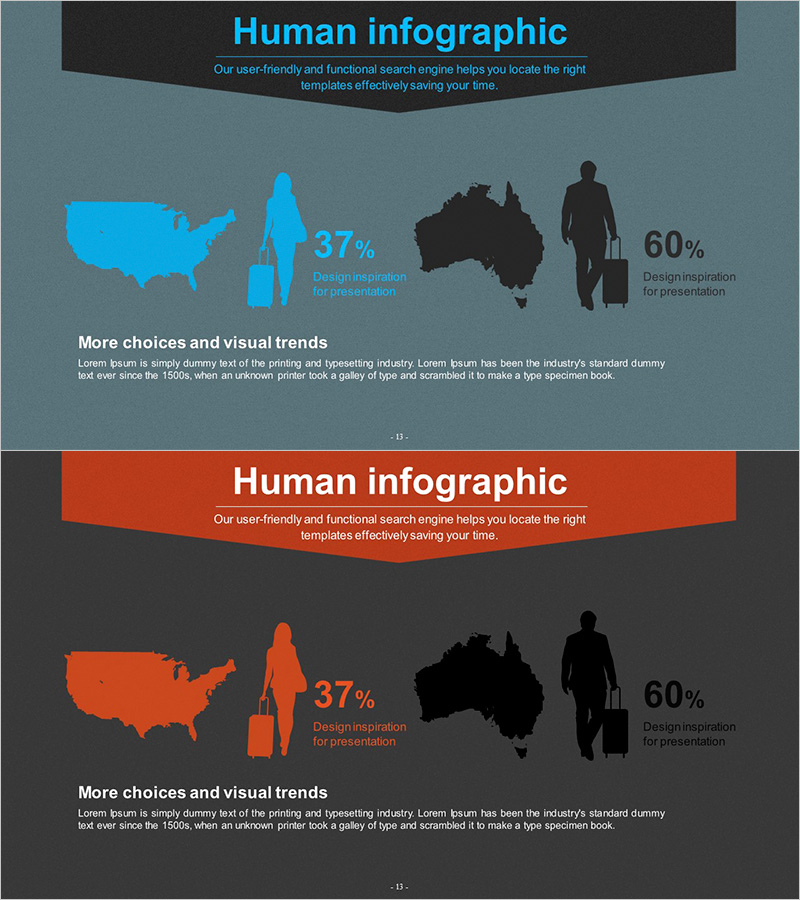
A 2-slide PowerPoint template that visualizes user distribution by country and region using maps and infographics. Features silhouettes of the USA and Australia alongside user percentages (37%, 60%) in a parallel layout, ready for immediate use in market analysis, customer analysis, and investor presentations. Available in two color versions—cyan and orange—with clearly defined text input areas and data spaces. The 16:9 widescreen PPTX format ensures compatibility with modern presentation environments and supports business reports, IR materials, and marketing plans.
Usage Points
-
Main Usage
Presents user distribution across countries and regions simultaneously through map silhouettes and numerical ratios, enabling clear communication of market size, customer composition, and target market analysis. Builds credibility when presenting global business status to investors, partners, and executives.
-
How to Use
Slide 1 features a cyan-toned map layout with country silhouettes and user percentages; Slide 2 provides the same structure in orange tones. Enter country/region names in the text input areas and insert actual user percentages, revenue figures, or market share data in the numerical fields for immediate deployment.
-
Recommended For
Market analysis and customer analysis sections in business plans, investor pitch decks, marketing strategies, and quarterly business reports. Particularly effective for presentations explaining global expansion or multi-region business status to executives, investors, and partners.
-
Slide Structure
2-slide deck with consistent 3-tier layout: header area (title and description), map silhouette area (country-specific color coding), and numerical ratio area (percentages and text labels). Left-aligned map with right-aligned data optimizes comparative analysis and information hierarchy.
Related Products
-

Diagram of User Gender Ratio by Country - Market and Customer Insights
#Market and Competitor Analysis #Other #Customer Analysis
-

Market Analysis Slide for Global Target Market
#Market and Competitor Analysis #Other #Customer Analysis
-

Data Visualization Slide Template Featuring World Map
#Market and Competitor Analysis #Graph #Other
-

User Usage Status by Target Country – Market Analysis and Insights
#Market and Competitor Analysis #Diagram #Other
