Segmented Bar Graph for Market Analysis – A Harmony of Teal and Orange
RJ0300050_16
- Last Update 05/01/2025
- File Size 5.1MB
- # of Slides 2
- File Format PPTX
- Slide Ratio 16:9
- Color
Keywords
About the Product
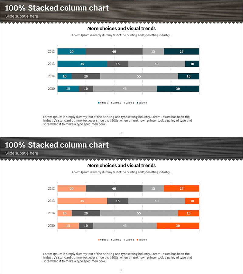
A segmented horizontal bar chart PowerPoint slide optimized for market analysis and competitive comparison. The design uses contrasting teal and orange colors to clearly distinguish four data series, visualizing year-over-year trends from 2012 to 2030 with four values per year. Each bar displays numerical labels for precise information delivery. This presentation slide is ready to use in company performance analysis, market share comparison, departmental results reporting, and various business presentations. The 16:9 widescreen format ensures compatibility with modern display standards.
Usage Points
-
Main Usage
This chart compares four data series across multiple years and analyzes market trends. The 100% stacked format displays both the overall composition ratio and individual absolute values simultaneously, making it highly effective for complex data analysis and multi-dimensional comparisons.
-
How to Use
Insert this slide into executive reports, business plans, and marketing strategy presentations in the market analysis section. Use it to show year-over-year performance trends, departmental results comparison, or product line revenue distribution. Simply input your data and the bar lengths adjust automatically. Colors and values are fully editable.
-
Recommended For
Recommended for executives, marketing managers, sales directors, financial analysts, and consultants who need data-driven decision-making. Ideal for quarterly performance reviews, annual business reports, competitive analysis presentations, and situations where quantitative information delivery is critical.
-
Slide Structure
Two-slide set with identical layouts providing color variation options. Each slide displays a 4-series horizontal bar chart showing data for four years (2012, 2013, 2014, 2030). The first slide uses teal and gray tones while the second uses orange and gray tones, allowing you to select the color scheme that best matches your presentation theme.
Related Products
-

Blue Orange Segmentation Graph – Market and Competitor Analysis
#Market and Competitor Analysis #Graph #Competitor Analysis
-

Pie Chart & Bar Graph for Market Analysis – Visualizing Data
#Market and Competitor Analysis #Graph #Market Status
-

Horizontal Bar Graph Segmentation Blue Yellow – Market Share Analysis
#Market and Competitor Analysis #Graph #Market Share
-

Sales Growth Rate and Profit Change Analysis Chart – Emphasizing Business Performance
#Business Strategy #Market and Competitor Analysis #Diagram
