Competitor Comparison Analysis Graph - Optimized for Market and Competitor Analysis
RJ0300048_16
- Last Update 05/01/2025
- File Size 6.1MB
- # of Slides 2
- File Format PPTX
- Slide Ratio 16:9
- Color
Keywords
About the Product
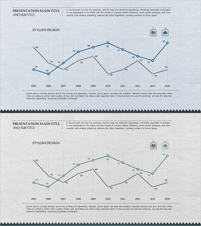
A multi-series line chart PowerPoint slide optimized for competitor comparison and market analysis presentations. This template visualizes data trends across three distinct series from 2005 to 2030, with precise numerical values displayed at each data point for accurate comparison. The design uses blue, black, and gray color schemes to differentiate multiple data lines, making it easy to track trend changes and identify patterns. The 16:9 widescreen format includes two slides that integrate seamlessly into business reports, competitive analysis decks, and strategic planning presentations. Ideal for displaying sales trends, market share evolution, and performance metrics across multiple competitors or business units.
Usage Points
-
Main Usage
Compare multiple data series over time to identify trends, patterns, and competitive positioning. Effectively communicate how different metrics or competitors have evolved across a defined time period, enabling stakeholders to make data-driven decisions.
-
How to Use
Insert into business reports, quarterly performance reviews, or competitive analysis presentations. Customize line colors to represent different competitors, product lines, or market segments. Replace sample data with your actual figures while maintaining the chart structure and formatting.
-
Recommended For
Marketing managers, business analysts, executives, and consultants presenting market trends and competitive benchmarking. Suitable for investor presentations, board meetings, strategic planning sessions, and annual performance reports.
-
Slide Structure
Two slides featuring line charts with X-axis showing years (2005–2030) and Y-axis displaying numerical values (0–90). Each slide contains three distinct data lines with labeled data points at every intersection. Grid background enhances readability and data point identification.
Related Products
-

Space Illustration Theme Broken Line Graph
#Market and Competitor Analysis #Graph #Competitor Analysis
-

Data Analysis Graph Visualization for Market Competition
#Market and Competitor Analysis #Diagram #Graph
-

Competitor Technology Comparison Graph – Market and Competitor Analysis
#Market and Competitor Analysis #Graph #Competitor Analysis
-

Graph Showing Trend of Confirmed COVID-19 Cases – Market Analysis
#Market and Competitor Analysis #Graph #Competitor Analysis
