Logistics Insights with 3D Column Chart – Business Strategy Direction
RJ0300043_9
- Last Update 04/29/2025
- File Size 3MB
- # of Slides 2
- File Format PPTX
- Slide Ratio 16:9
- Color
Keywords
- #Content-Based Slides
- #Design-Based Slides
- #Business Strategy
- #Market and Competitor Analysis
- #Graph
- #Business Direction
- #Market Analysis
- #Column
- #Column Chart
- #16:9
- #column chart PowerPoint
- #logistics data analysis presentation
- #4-series bar chart slide
- #data comparison template
- #business analysis graph
- #vertical bar chart download
About the Product
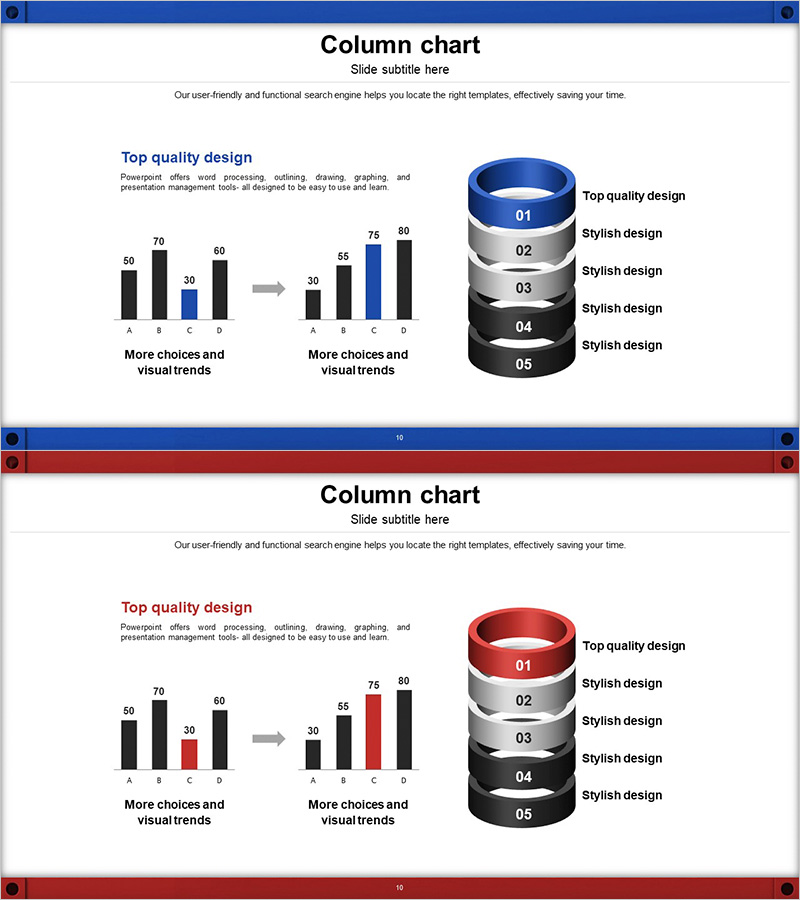
A 4-series vertical column chart PowerPoint slide designed for logistics data analysis and business strategy presentations. The 3D bar chart uses black and blue color gradients to compare four data points (A, B, C, D) with values ranging from 30 to 80, connected by directional arrows showing data transformation and trend analysis. The right side features a 5-tier cylindrical diagram with numbered segments (01–05) for layered insights, while the left text area provides context for findings. The slide effectively visualizes comparative metrics, cost analysis, and market performance in a single layout. Delivered in 16:9 widescreen format with 2 fully editable slides.
Usage Points
-
Main Usage
Visualize logistics and supply chain metrics using 3D vertical column charts to compare four data series simultaneously. Ideal for presenting performance indicators, cost breakdowns, market share analysis, and quarterly business reviews with clear numerical comparisons and trend visualization.
-
How to Use
Use the left-to-right arrow flow to show data transformation or improvement cycles. Replace sample values (50, 70, 60, 30, etc.) with actual metrics. Leverage the 5-tier cylindrical diagram on the right to represent hierarchical insights or strategic phases. Edit text descriptions to match your presentation context and key findings.
-
Recommended For
Logistics and supply chain managers, business planning teams, executive performance reports, competitive market analysis, quarterly and annual business reviews, investor pitch decks, and data-driven strategy presentations requiring multi-series numerical comparisons.
-
Slide Structure
2-slide set with consistent layout: title area at top, 4-series vertical column chart (items A–D, values 30–80 range) in center-left, directional arrow connector, 5-tier 3D cylindrical diagram (segments 01–05) on right, and text explanation area. Color scheme uses black, blue, and gray gradients to emphasize data hierarchy and visual flow.
Related Products
-

Gradient Analysis Bar Graph – Optimized for Market and Competitor Analysis
#Market and Competitor Analysis #Graph #Competitor Analysis
-

Business Plan Presentation Template - World Wide Map
#Market and Competitor Analysis #Financial Plans and Performance #Graph
-

Business Market Analysis Bar Graph – Visualizing Competitive Analysis
#Market and Competitor Analysis #Diagram #Graph
-

Vertical Bar Graph Template for Business Plan
#Market and Competitor Analysis #Graph #Competitor Analysis
