Logistics Data by Year Pie Chart – Strategy for Competitor Analysis
RJ0300043_19
- Last Update 04/29/2025
- File Size 3.3MB
- # of Slides 2
- File Format PPTX
- Slide Ratio 16:9
- Color
Keywords
- #Content-Based Slides
- #Design-Based Slides
- #Market and Competitor Analysis
- #Diagram
- #Graph
- #Competitor Analysis
- #Market Analysis
- #Table
- #Circles
- #Standard Table
- #Pie Chart
- #16:9
- #pie chart PowerPoint slide
- #circular graph presentation
- #logistics data visualization
- #ratio comparison chart
- #year-over-year analysis slide
About the Product
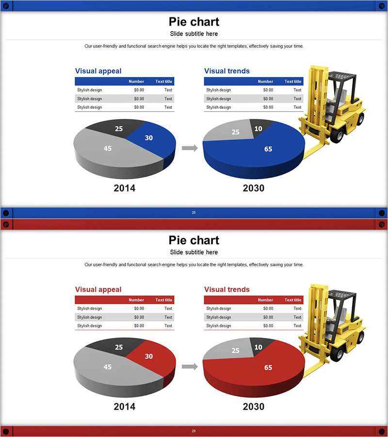
A PowerPoint slide visualizing logistics data for 2014 and 2030 using 4-segment pie charts. The 3D pie graphs in blue and gray tones are connected by an arrow to show data changes over time. Each slide includes a data table and forklift icon to emphasize logistics industry expertise. Available in 16:9 PPTX format for immediate editing. Ideal for competitor analysis presentations, market trend reports, and strategic planning materials.
Usage Points
-
Main Usage
Visualize logistics data composition ratios using pie charts to clearly communicate changes over time. Supports data-driven decision-making in competitor analysis, market trend assessment, and business strategy development.
-
How to Use
Insert into market analysis or competitive analysis sections of presentations to explain logistics industry data trends. Present tables and charts together to enhance audience comprehension, and use the forklift icon to reinforce industry context.
-
Recommended For
Suitable for executive reports, business plans, and investor pitch decks in logistics, transportation, and distribution companies. Valuable for market analysts, strategic planning teams, and sales professionals delivering data-driven presentations.
-
Slide Structure
2-slide set. Each slide features a title at top, data table (3 rows × 3 columns) on left, two 4-segment pie charts (2014 and 2030) in center, and forklift icon on right. Arrow indicates year-over-year change flow.
Related Products
-

Graph Chart for Analysis Comparison – Market and Competitor Analysis
#Market and Competitor Analysis #Diagram #Graph
-

Comparative Analysis Graph – Optimal Tool for Market and Competitor Analysis
#Market and Competitor Analysis #Graph #Competitor Analysis
-

Gradient Theme Area Diagram – Market and Competitor Analysis
#Market and Competitor Analysis #Diagram #Graph
-

Business Note Analysis Circle Graph & Table – Market and Competitive Analysis
#Market and Competitor Analysis #Diagram #Graph
