Circular Highlight Bar Graph – Optimal for Market and Competitor Analysis
RJ0300041_7
- Last Update 04/28/2025
- File Size 1.2MB
- # of Slides 2
- File Format PPTX
- Slide Ratio 16:9
- Color
Keywords
- #Content-Based Slides
- #Design-Based Slides
- #Market and Competitor Analysis
- #Graph
- #Competitor Analysis
- #Market Analysis
- #Horizontal Bar
- #Horizontal Bar Chart
- #16:9
- #horizontal bar chart PowerPoint
- #bar graph slide template
- #time-series data visualization
- #market analysis PPT
- #competitor comparison chart
- #revenue growth trend slide
About the Product
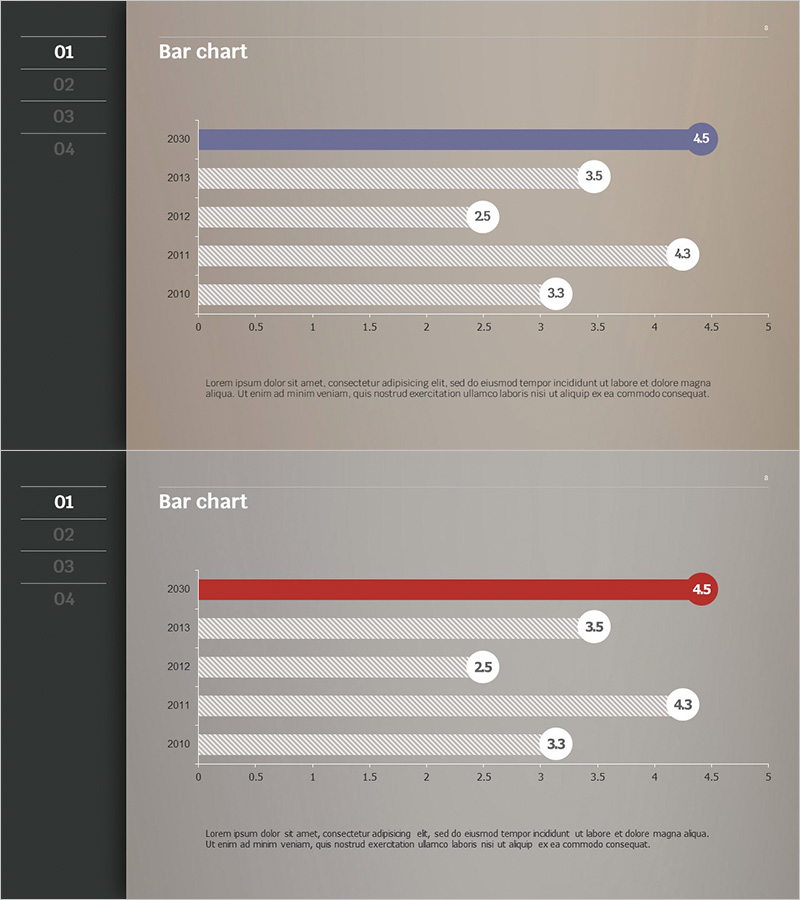
A horizontal bar chart PowerPoint slide comparing numerical data across five years (2010–2030) with blue and red highlight bars to distinguish latest performance from historical data. Each bar displays a numerical label at the end for precise information delivery. This 16:9 widescreen 2-slide set is ready to use for market analysis, competitor comparison, revenue growth trends, and business performance presentations. The bar length and color coding clearly express data priority and comparative insights in your slide deck.
Usage Points
-
Main Usage
Visualize year-over-year and item-by-item numerical comparisons and growth trends using horizontal bars. Blue and red highlight bars simultaneously display latest achievements and historical performance, while numerical labels at bar ends convey exact values. Ideal for business analysis presentations including market size changes, competitor performance benchmarking, and departmental revenue trends.
-
How to Use
Replace the five year labels and numerical values with your own data. Assign the blue bar to your primary metric and the red bar to your emphasis point, adjusting colors and figures as needed. Add your analysis topic (e.g., market share, competitor revenue) to the title area and include insights in the description text below to complete the slide.
-
Recommended For
Recommended for marketing, sales, and strategy team presentations on market analysis, executive reports, investor relations (IR) materials, and business plan documents. Particularly effective when comparing year-over-year growth rates, competitive advantages, and departmental performance metrics. Suitable for financial analysis, sales performance reporting, and strategic planning presentations.
-
Slide Structure
Two-slide set with the first slide featuring a blue highlight bar (2030 data: 4.5 emphasized) and the second slide featuring a red highlight bar (2030 data: 4.5 emphasized). Each slide contains five year items (2010, 2011, 2012, 2013, 2030), a horizontal axis ranging 0–5, numerical labels at bar ends (3.3, 4.3, 2.5, 3.5, 4.5), left navigation menu, and a description area at the bottom.
Related Products
-

Competitor and Market Analysis Slide – Pink & Bluegreen PowerPoint Template
#Market and Competitor Analysis #Graph #Competitor Analysis
-

Mobile SNS Market Analysis Graph – Visualizing Competitor Analysis Data
#Market and Competitor Analysis #Diagram #Graph
-

Trade Business Analysis Bar Chart - Insights on Competitors and Markets
#Market and Competitor Analysis #Graph #Competitor Analysis
-

Data Analysis Bar Graph – Essential for Market and Competitor Analysis
#Market and Competitor Analysis #Graph #Competitor Analysis
