Pie & Bar Analysis Graphs – Optimized for Market and Competitor Analysis
RJ0300039_10
- Last Update 04/28/2025
- File Size 1.7MB
- # of Slides 2
- File Format PPTX
- Slide Ratio 16:9
- Color
Keywords
- #Content-Based Slides
- #Design-Based Slides
- #Market and Competitor Analysis
- #Graph
- #Competitor Analysis
- #Market Analysis
- #Column
- #Circles
- #Column Chart
- #Pie Chart
- #16:9
- #pie chart PowerPoint slide
- #bar graph template
- #data visualization presentation
- #market analysis chart
- #competitor comparison slide
- #ratio comparison template
About the Product
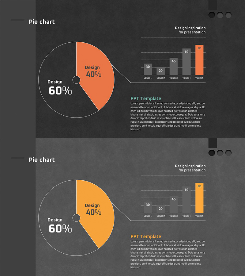
A professional PowerPoint slide set optimized for market analysis and competitor comparison presentations. The first slide features a 2-segment pie chart clearly displaying 60% and 40% proportions, while the second slide visualizes five data points through a bar graph. Set against a dark gray background with orange accent color, the design emphasizes key data insights. The 16:9 widescreen format with 2-slide composition enables immediate integration into presentation decks. Clearly defined data input areas facilitate seamless editing and customization. This slide template effectively communicates quantitative analysis results in business presentations, making it ideal for market research, competitive analysis, and financial reporting.
Usage Points
-
Main Usage
Simultaneously present quantitative data using two complementary chart types—pie chart for compositional ratios and bar graph for comparative values. This dual-chart approach enables comprehensive market analysis and competitive benchmarking with clear visual hierarchy.
-
How to Use
Input market share or budget allocation percentages into the first slide's pie chart, then populate the second slide's bar graph with five data points such as competitor revenue, customer satisfaction scores, or technology ratings. Modify the orange accent areas to reflect your organization's data and customize text labels to match your presentation context.
-
Recommended For
Marketing strategy presentations, business plan financial sections, quarterly performance reports, investor pitch decks, executive briefings, consulting proposals, market research findings, and any business presentation requiring quantitative comparative analysis and data-driven decision support.
-
Slide Structure
Slide 1: Central pie chart (2 segments, 60%/40% labeled) + upper-right 5-item bar graph + text annotation area. Slide 2: Identical layout with color variation (orange to yellow accent). All numeric input fields are clearly demarcated for distraction-free data entry and modification.
Related Products
-

Market Overview PowerPoint Slide – Two Panel Market Analysis
#Market and Competitor Analysis #Graph #Market Status
-

Vertical Bar Graph & Folder Diagram – Market and Competitor Analysis
#Market and Competitor Analysis #Diagram #Graph
-

Comparative Analysis Vertical Bar Graph – Gaining Competitive Advantage through Market Analysis
#Market and Competitor Analysis #Graph #Competitor Analysis
-

Competitor and Market Analysis Green Navy Slide
#Market and Competitor Analysis #Graph #Competitor Analysis
