Market and Competitor Analysis
User Analysis Results Diagram - Infographic for Customer Insights
RJ0300029_26
- Last Update 12/21/2025
- File Size 1.6MB
- # of Slides 2
- File Format PPTX
- Slide Ratio 16:9
- Color
Keywords
About the Product
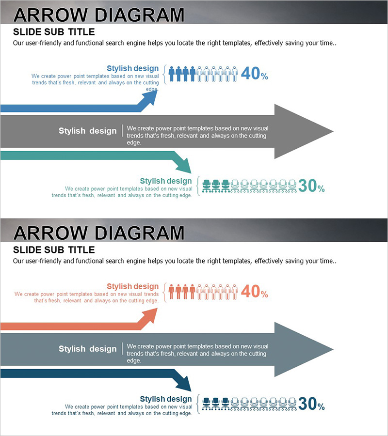
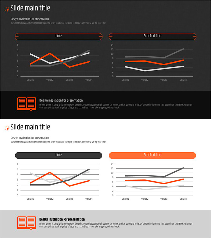
This slide features an arrow diagram that visually represents user analysis results. Effectively showing the proportion in each section, it utilizes a harmonious color scheme of teal and blue to convey trust. This diagram is used to clearly communicate market analysis and customer insights. By emphasizing the significance of each user group through its proportions, it facilitates intuitive understanding of the data. Highly useful in practical scenarios like customer analysis and market research, this slide allows for quick editing and adaptability for users.
Related Products
-
Graphs that draw a successful future outlook – Visualizing Market Trends
#Market and Competitor Analysis #Graph #Other
-
Market Share Analysis with Horizontal Bar Chart – Harmonizing Blue and Red
#Market and Competitor Analysis #Graph #Market Share
-
Visualizing Percentage of Product Sales by Period with Bar Charts – Market and Revenue Analysis
#Market and Competitor Analysis #Financial Plans and Performance #Graph
-
Orange Hexagon Presentation Template Line Chart
#Market and Competitor Analysis #Graph #Competitor Analysis
