Market and Competitor Analysis
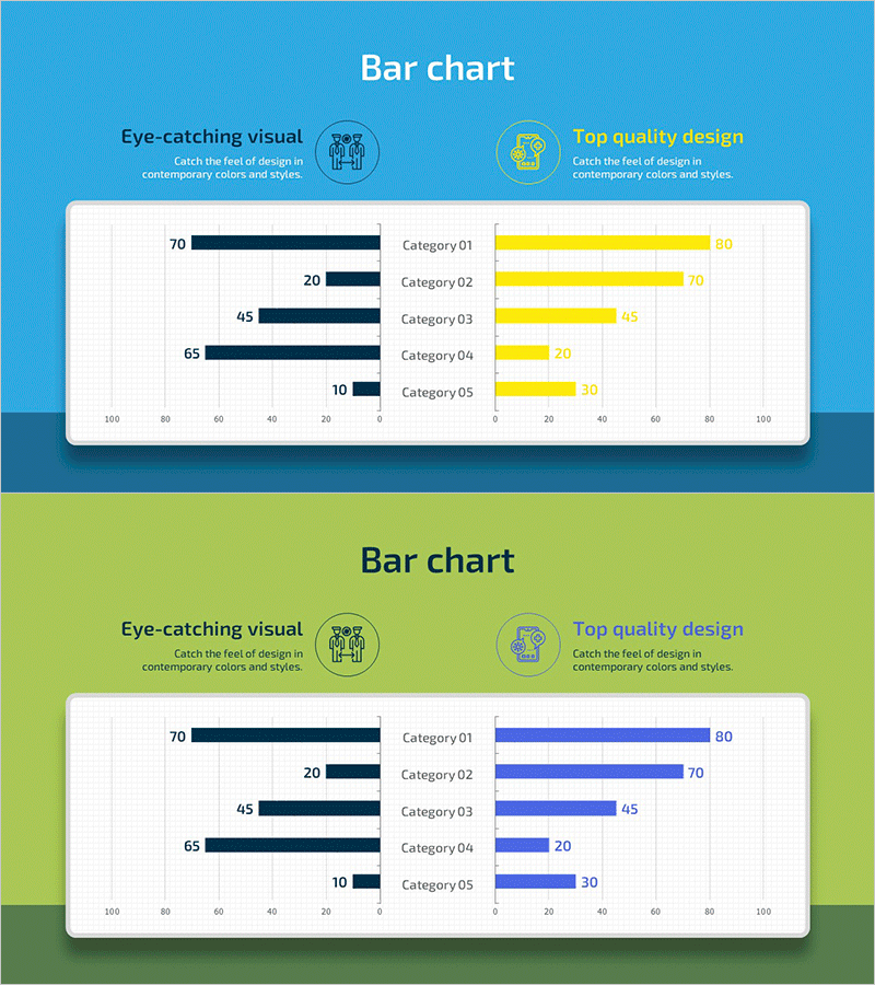
Social Distancing Vaccination Rate Comparison Graph – Essential Tool for Market Analysis
RJ0700023_14
- Last Update 12/21/2025
- File Size 0.8MB
- # of Slides 2
- File Format PPTX
- Slide Ratio 16:9
- Color
Keywords
About the Product
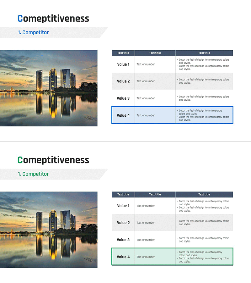
This slide presents a horizontal bar graph comparing vaccination rates relevant to social distancing, providing clear data visualization for market and competitor analysis. The blend of blue and green colors adds vibrancy, while the dimensions of each category facilitate easy comparative insights on competitors. This material is suitable for government reports, health-related presentations, and research documents. Its easy editability allows for straightforward replacement of data and text, providing users with intuitive insights. The editing difficulty level is rated as 'easy', making it accessible to a variety of users.
Related Products
-
Orange Red Point Table – Visualization of Financial Performance
#Financial Plans and Performance #Diagram #Sales and Revenue
-
Surveys on Crisis and Help – Intuitive Data Visualization
#Market and Competitor Analysis #Graph #Customer Analysis
-
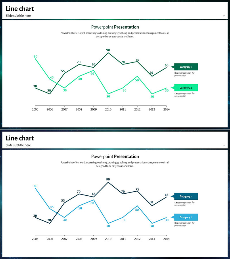
Blue Green Tone Competitor Analysis Broken Line Graph
#Market and Competitor Analysis #Graph #Competitor Analysis
-
Competitor Analysis Table – Visualizing Market Advantage
#Market and Competitor Analysis #Diagram #Competitor Analysis
