Market and Competitor Analysis
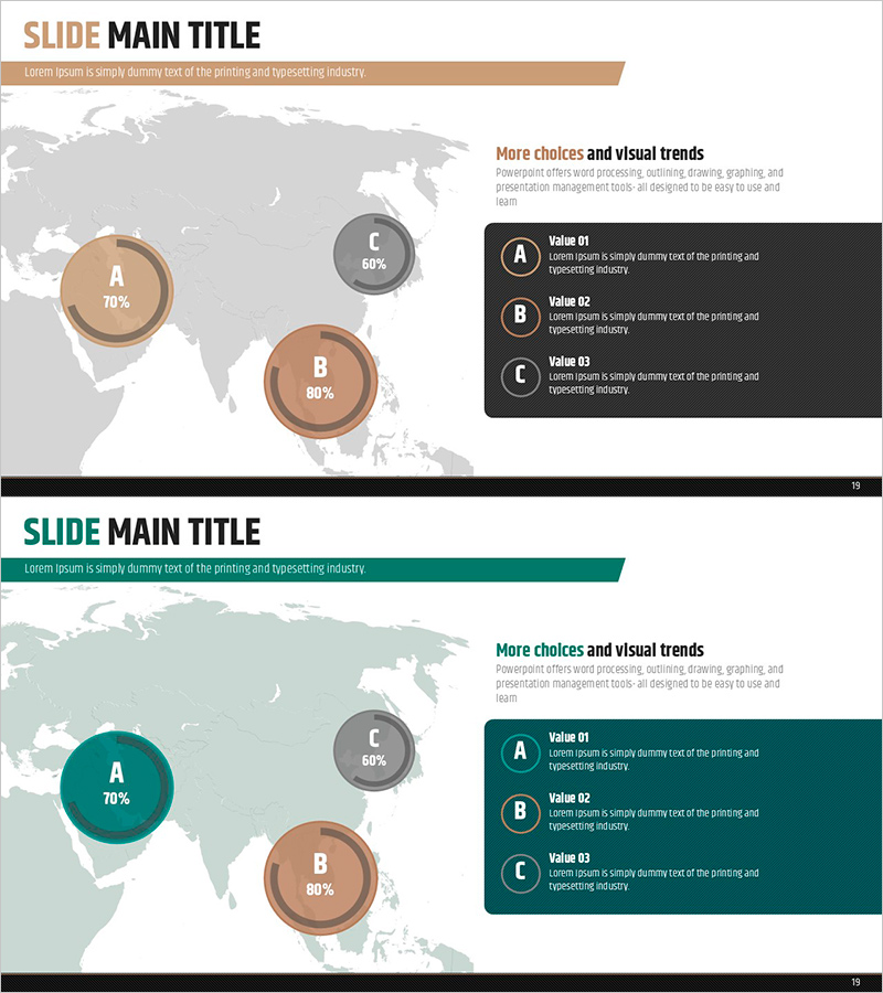
Analyzing ABC District Occupancy with Doughnut Chart
RJ0900019_18
- Last Update 12/21/2025
- File Size 0.7MB
- # of Slides 2
- File Format PPTX
- Slide Ratio 16:9
- Color
Keywords
About the Product
This slide utilizes a doughnut chart to provide a clear visual analysis of occupancy rates in the ABC District. The graph intuitively presents the occupancy percentages of areas A, B, and C, using a brown and green color palette to convey professionalism and stability. This slide is particularly effective in market share analysis reports or competitive analysis presentations, strongly emphasizing the theme of 'market share'. Text fields are easily replaceable, with an editing difficulty rated as 'easy', allowing for quick integration into various presentations.
Related Products
-

Business Project Development Status Analysis Graph
#Product/Service #Business Introduction #Graph
-
Sleek Diagram Slide for Target Area Analysis
#Company Introduction #Market and Competitor Analysis #Diagram
-
Business Area Analysis Donut Chart – Clear Visualization
#Product/Service #Business Introduction #Graph
-
Customer Evaluation and Feedback Analysis Graph – Insights Centered on Customers
#Market and Competitor Analysis #Customer Success Stories #Diagram
