Graph
Horizontal Bar Comparison Graph – Effective Data Visualization
RJ0800020_11
- Last Update 12/21/2025
- File Size 0.2MB
- # of Slides 2
- File Format PPTX
- Slide Ratio 16:9
- Color
Keywords
About the Product
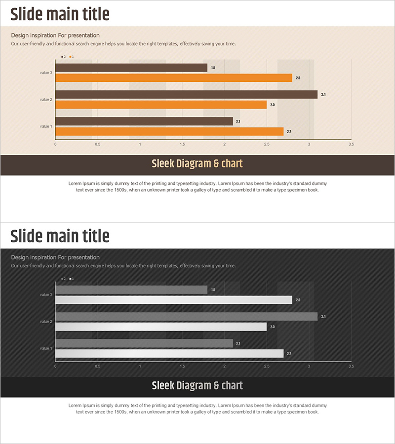
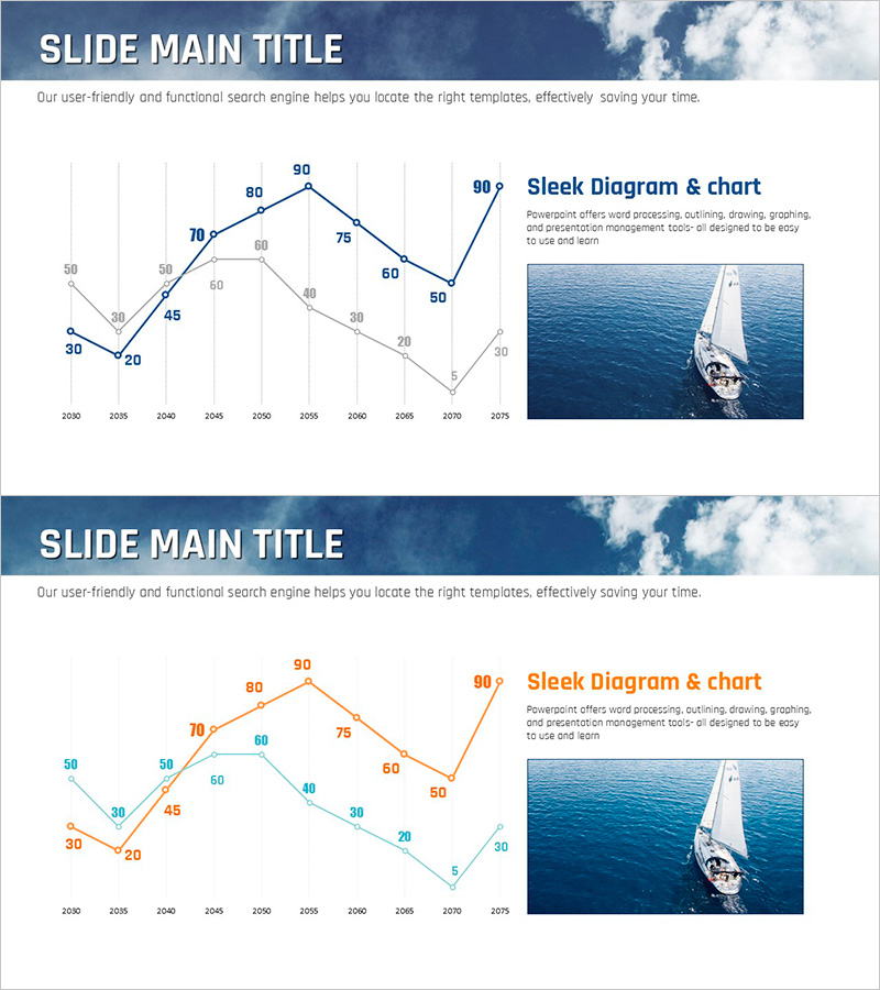
This slide features a horizontal bar comparison graph, enabling intuitive comparison of multiple data points. The striking contrast of orange and gray clearly highlights differences in data, with a clean layout that allows the audience to easily absorb information. This template is optimized for presenting business performance, market trends, and comparative information across categories. It is suitable for various business contexts such as internal reports, investment presentations, or marketing strategy discussions, with easy text and data modifications rated as 'easy' on editing difficulty.
Related Products
-
Competitive Strengths Comparison Chart – An Effective Market Analysis Tool
#Product/Service #Market and Competitor Analysis #Diagram
-
Competitive Advantage 3D Bi-directional Bar Graph – Essential Tool for Market Analysis
#Market and Competitor Analysis #Graph #Competitor Analysis
-
Blue Green Basic Line Chart – Visualizing Data
#Graph
-
Sea Lighthouse Goal Market Strategy Line Graph – Revenue and Profit Growth
#Market and Competitor Analysis #Financial Plans and Performance #Graph
