Financial Plans and Performance
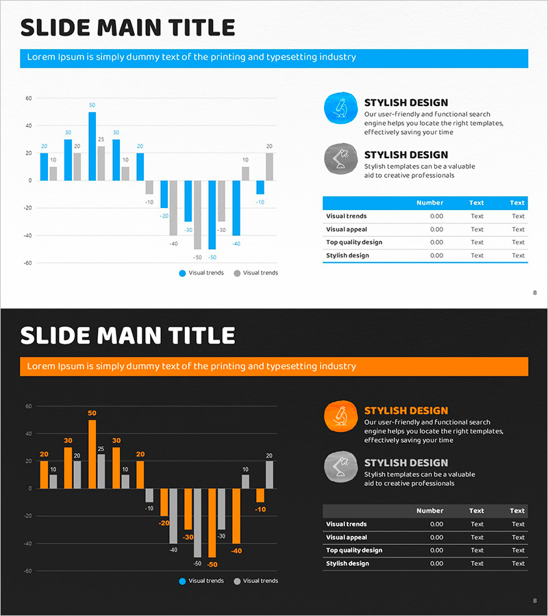
Blue Orange Profit and Loss Chart – Visualizing Financial Performance
RJ0500031_7
- Last Update 12/21/2025
- File Size 1.9MB
- # of Slides 2
- File Format PPTX
- Slide Ratio 16:9
- Color
Keywords
About the Product
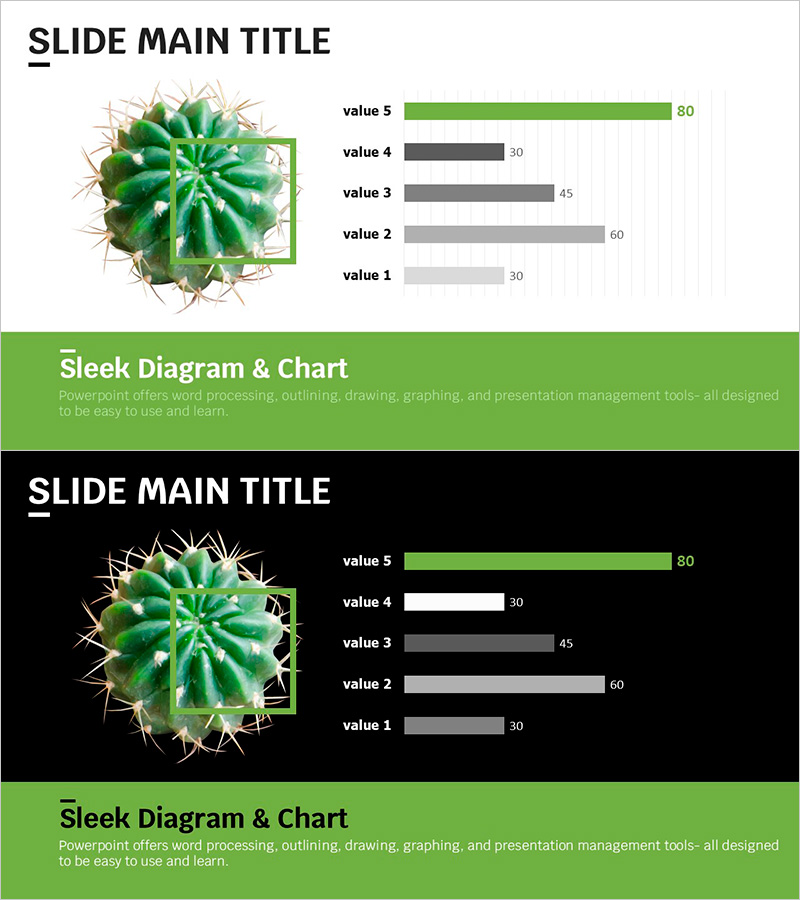
This slide utilizes the Blue Orange Profit and Loss Chart to effectively visualize corporate financial performance. Incorporating both horizontal and vertical bars allows for comprehensive data comparison, while the harmonious blend of blue and orange captures attention, making it ideal for analyzing key financial indicators. It can also be used in presentation materials related to income statements or financial planning, allowing for brief explanations corresponding to each data point. Therefore, it is particularly useful for professionals and entrepreneurs aiming to effectively communicate their financial strategies.
Related Products
-
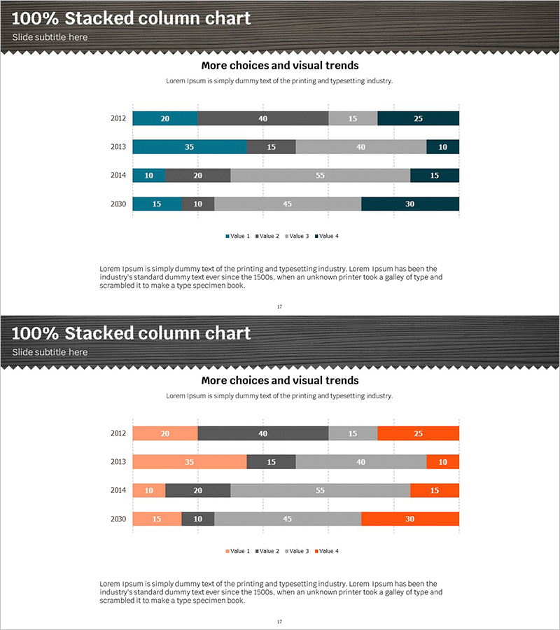
Segmented Bar Graph for Market Analysis – A Harmony of Teal and Orange
#Market and Competitor Analysis #Graph #Market Analysis
-
Gradient Thermometer Shape Graph – Market and Competitor Analysis
#Market and Competitor Analysis #Graph #Competitor Analysis
-
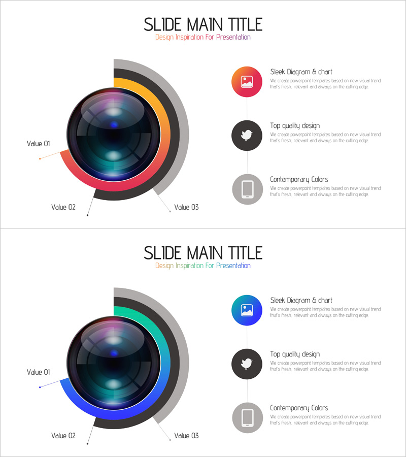
Camera Usage App Analysis – Innovation and Insight
#Product/Service #Diagram #Graph
-
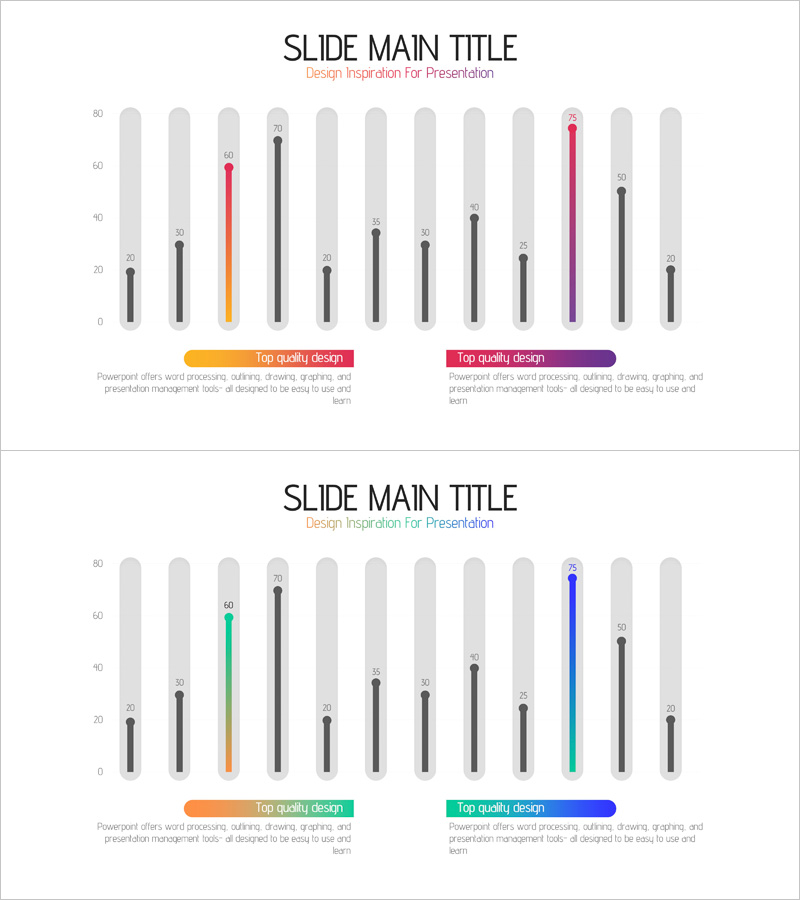
Trend Color Wide Template Bar Chart
#Product/Service #Graph #Development Status
