Graph
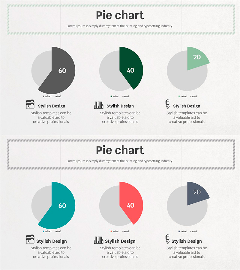
Visual Data Analysis with Simple Triple Pie Chart – Design and Intuition
RJ0500024_7
- Last Update 12/21/2025
- File Size 1.8MB
- # of Slides 2
- File Format PPTX
- Slide Ratio 16:9
- Color
About the Product
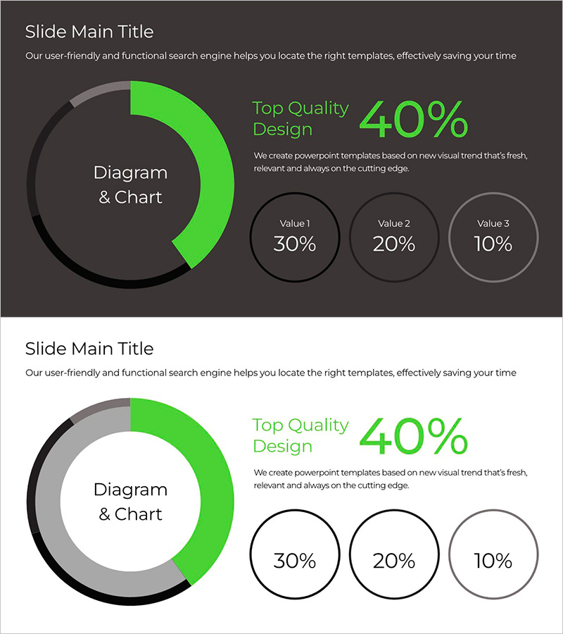
This slide uses a simple triple pie chart to intuitively visualize data analysis. Each pie chart clearly represents three different data points, allowing users to easily identify each value by color. The green and red color palette is suitable for emphasizing essential elements in a developing business environment. This slide can be utilized in various contexts such as data analysis reports, marketing presentations, and customer performance reviews.
Related Products
-
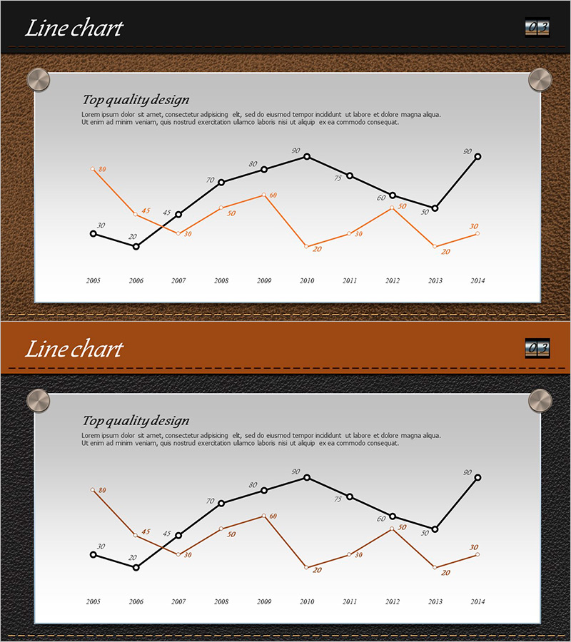
Leather Material Presentation Template Line Chart – Business Strategy
#Business Promotion Strategy #Market and Competitor Analysis #Graph
-
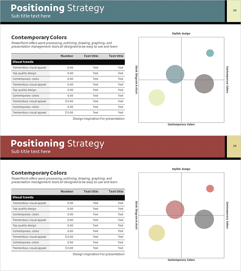
Strategic Positioning Map – Market Analysis and Marketing Strategy
#Market and Competitor Analysis #Marketing Plan and Strategy #Diagram
-
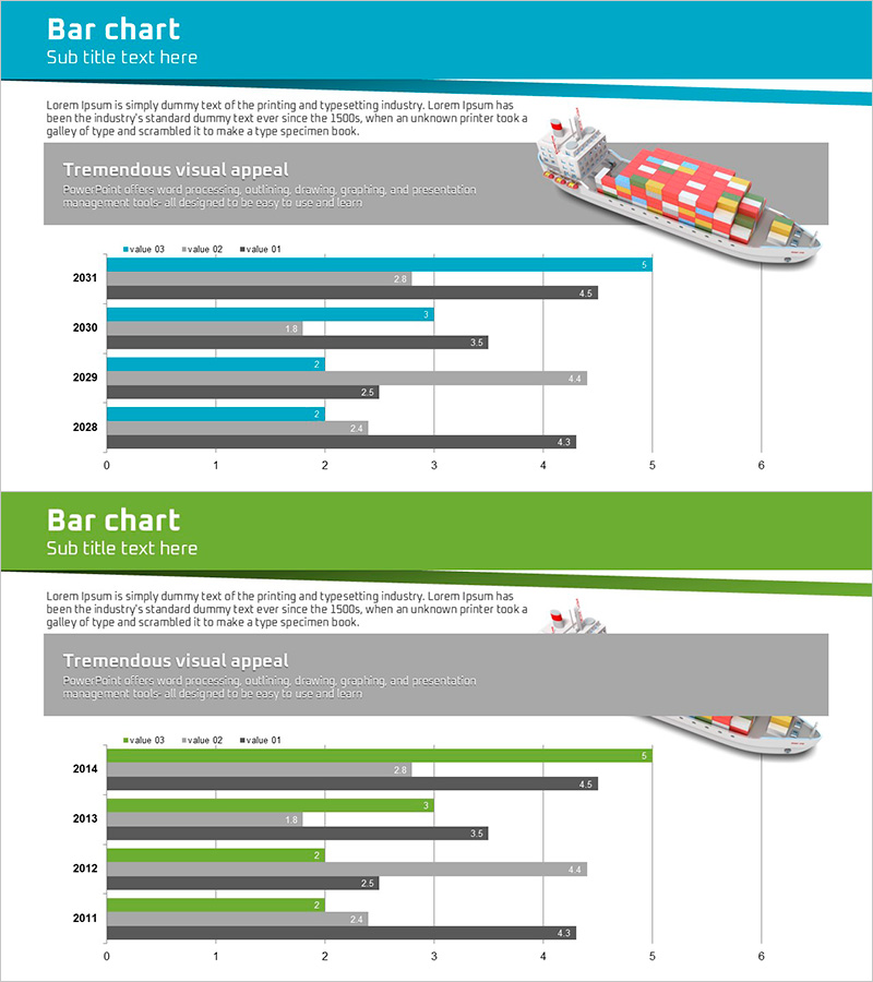
Business Forest Wide Template Bar Chart – Market Analysis and Competitive Strategy
#Market and Competitor Analysis #Marketing Plan and Strategy #Graph
-
Green & Gray Wide Donut Chart Template – Product and Operational Planning
#Product/Service #Financial Plans and Performance #Graph
